Bonne Nuit Guten Morgen
Sleeping cars on railway posters
 Nederlandse versie
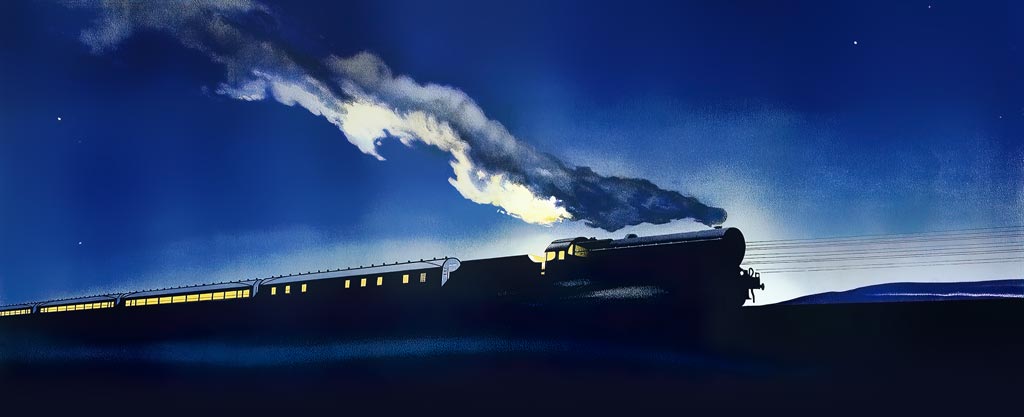
For train journeys lasting longer than a day, luxury sleeping cars were introduced in the late 19th century. They were operated by specialized companies such as Wagons-Lits and later Mitropa. The first decades the 'mobile hotels' were only available to the wealthy. Posters advertising overnight travel featured sleeping beauties and lots of dark blue.
After World War II affordable options became available for mass tourism, but some of the romance disappeared. By the year 2000 the number of overnight services declined sharply due to the rise of high-speed trains and cheap airline tickets. Because of climate change, night trains are currently experiencing a renaissance. Will the same be true for posters?
Wagons-Lits
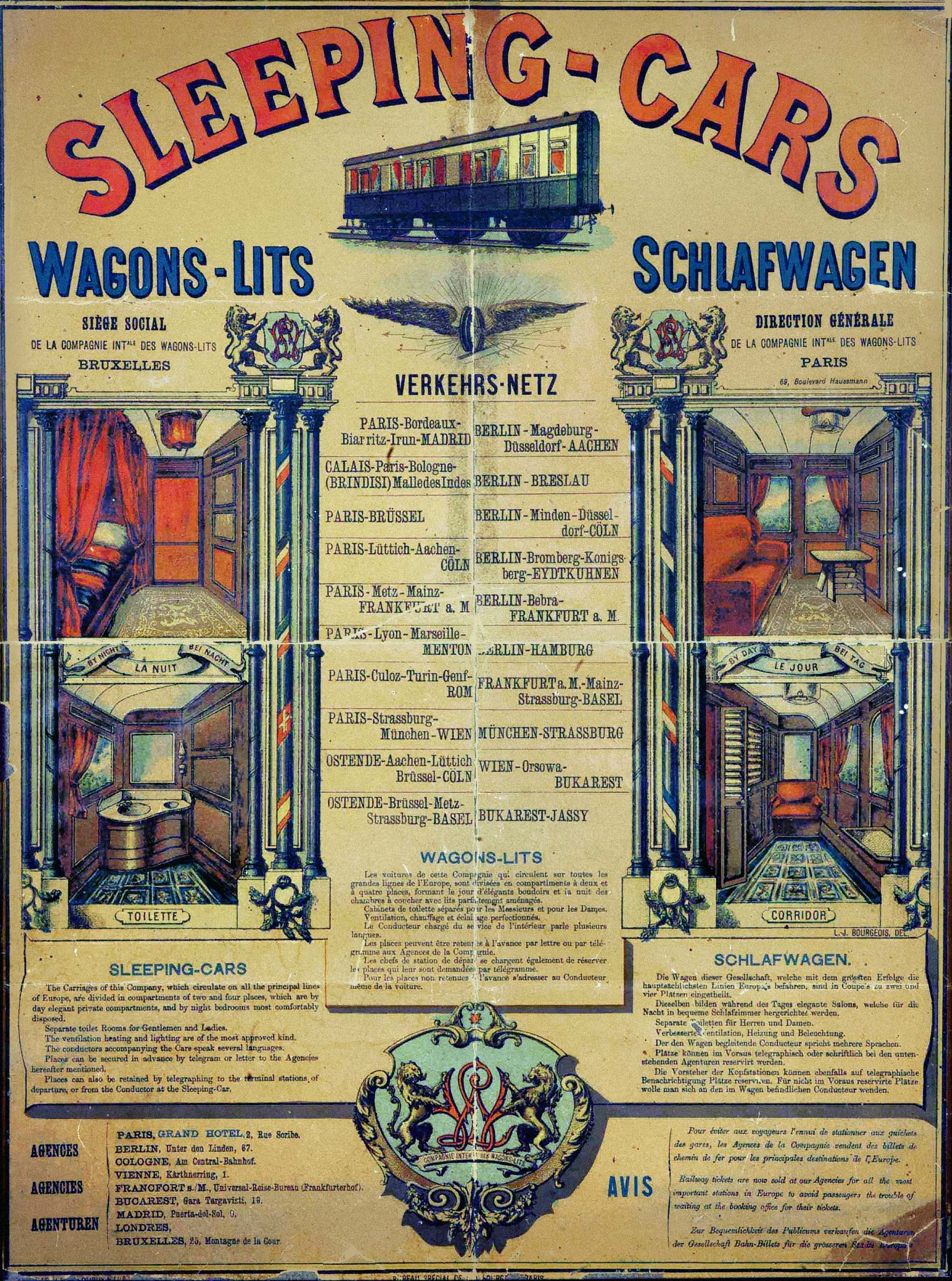
Since 1865 the Pullman Palace Car Company provided luxury sleeping cars on the extensive American railroads. When the Belgian banker's son Georges Nagelmackers traveled through the US by Pullman train, he saw a gap in the European market. In 1876 Nagelmackers founded his Compagnie Internationale des Wagons-Lits (literally: international sleeping car company) , simply called Wagons-Lits in short. He concluded agreements with many railway companies to run sleeping cars in existing trains. Soon the network stretched from Madrid to Bucharest.
The oldest Wagons-Lits poster from 1880 still shows a short sleeping car with three fixed wheel axles. A few years later bogies (trucks) were introduced, allowing for longer carriages that didn't derail in curves, at the same time providing better ride quality. The new sleeping cars ran so smoothly that one could shave at a speed of 80 km/h, as one passenger described. In 1883 Wagons-Lits also started exclusive luxury trains without any regular carriages. Only first-class tickets with surcharge were available, exclusively affordable for the elite. The Orient Express was the first of these luxury trains, soon followed by the Mediterranée Express, Nord Express and Rivièra Express.
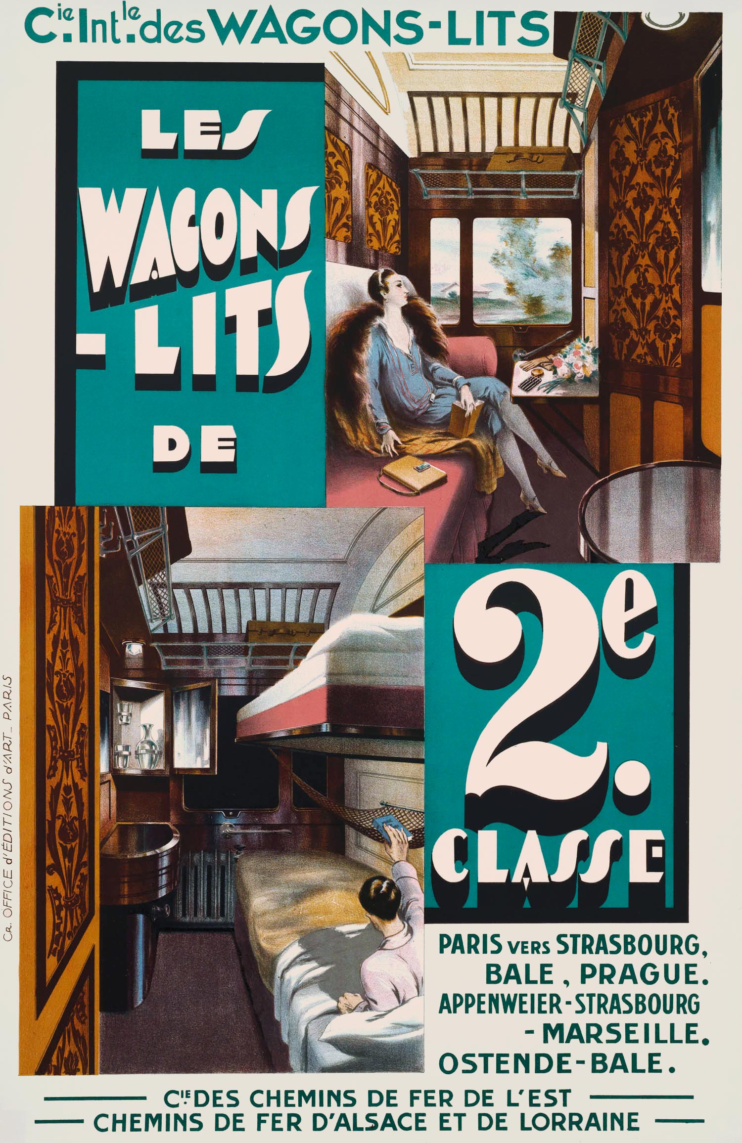
In the years after First World War I, Wagons-Lits gradually replaced its old teak carriages with new steel ones. They had Art Deco interiors and still only first class compartments. In 1929, because of economic conditions, the company also introduced second-class sleeping cars with slightly less space. The class difference was rather small, judging from an anonymous poster. It shows a beautifully upholstered two-person compartment — with its own washbasin — in both day and night setting, when the couch was 'converted' into two beds by the conductor.
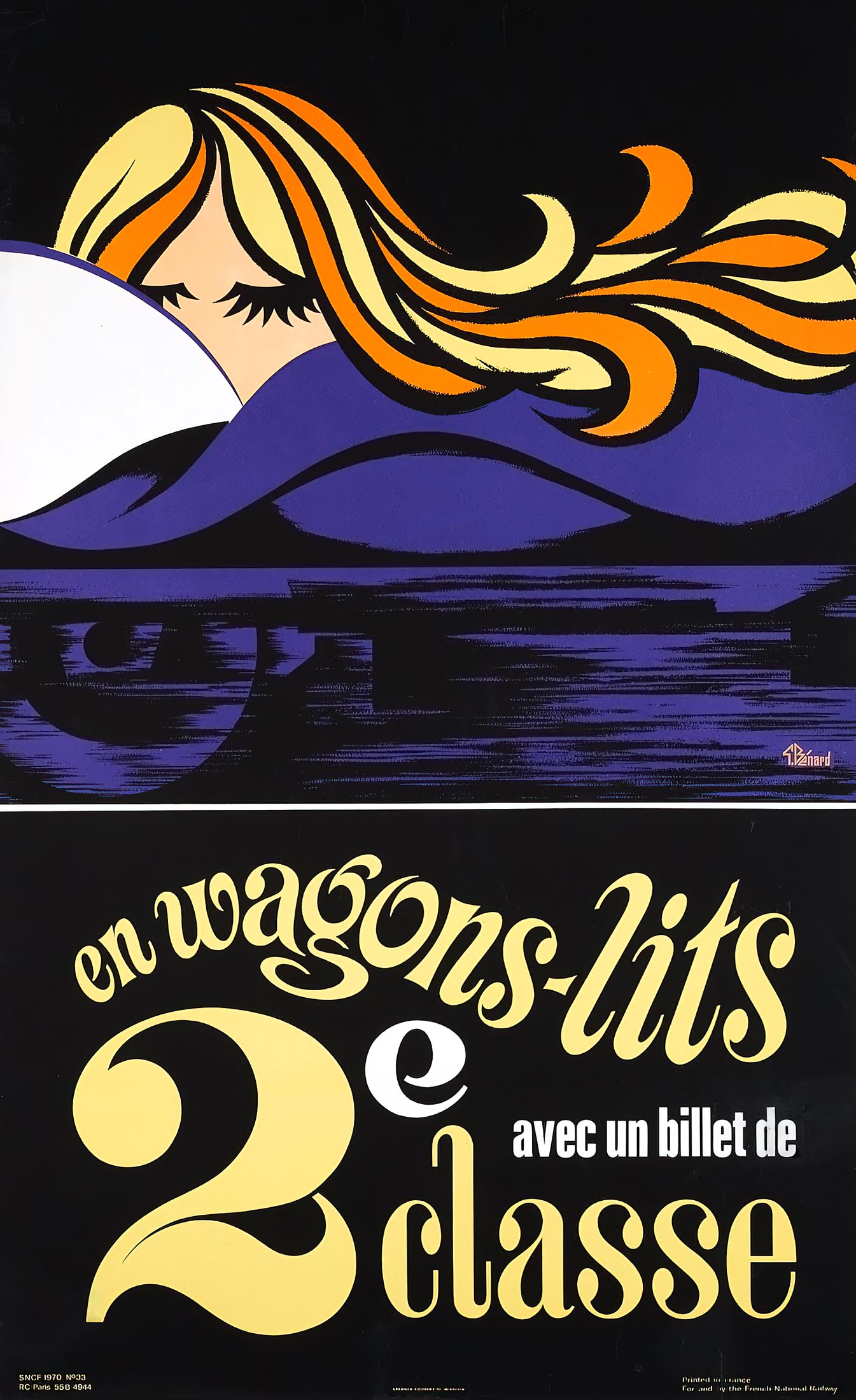
Much more modern was the poster by the influential French designer A.M. Cassandre that was issued only a year later. Instead of the inside or exterior of a sleeping car he depicted the deep blue night, interrupted by a red signal light along the track. Cassandre's son Henri Mouron later wrote: 'En Wagon-Lits de 2e Classe (1930), Cassandre’s last railroad poster and an example of a design inspired by the theme of the urban landscape, is unquestionably persuasive. The breathtakingly simple device of a red light glowing in the foggy darkness of a railroad siding is perfectly consistent with our poetically charged experience of looking out the window of a speeding night express.' This poster was released in several versions, with and without the large '2' of second class.

Mitropa
At the end of the First World War, Germany saw an opportunity to break the monopoly of the Belgian-French Wagons-Lits company. With a mishmash of sleeping and dining cars, a Middle European counterpart was established, which soon was named Mitropa. After the German defeat Mitropa's market was limited to Germany, Austria and northern neighboring countries. In 1927 Mitropa ordered 68 new steel sleeping cars. With these, Mitropa also acquired a modern corporate identity, designed by the 'godfather' of modern logo design, Karl Schulpig. The carriages were painted burgundy red with yellow lettering and the Mitropa logo: an eagle's head with the letter M and a wheel.
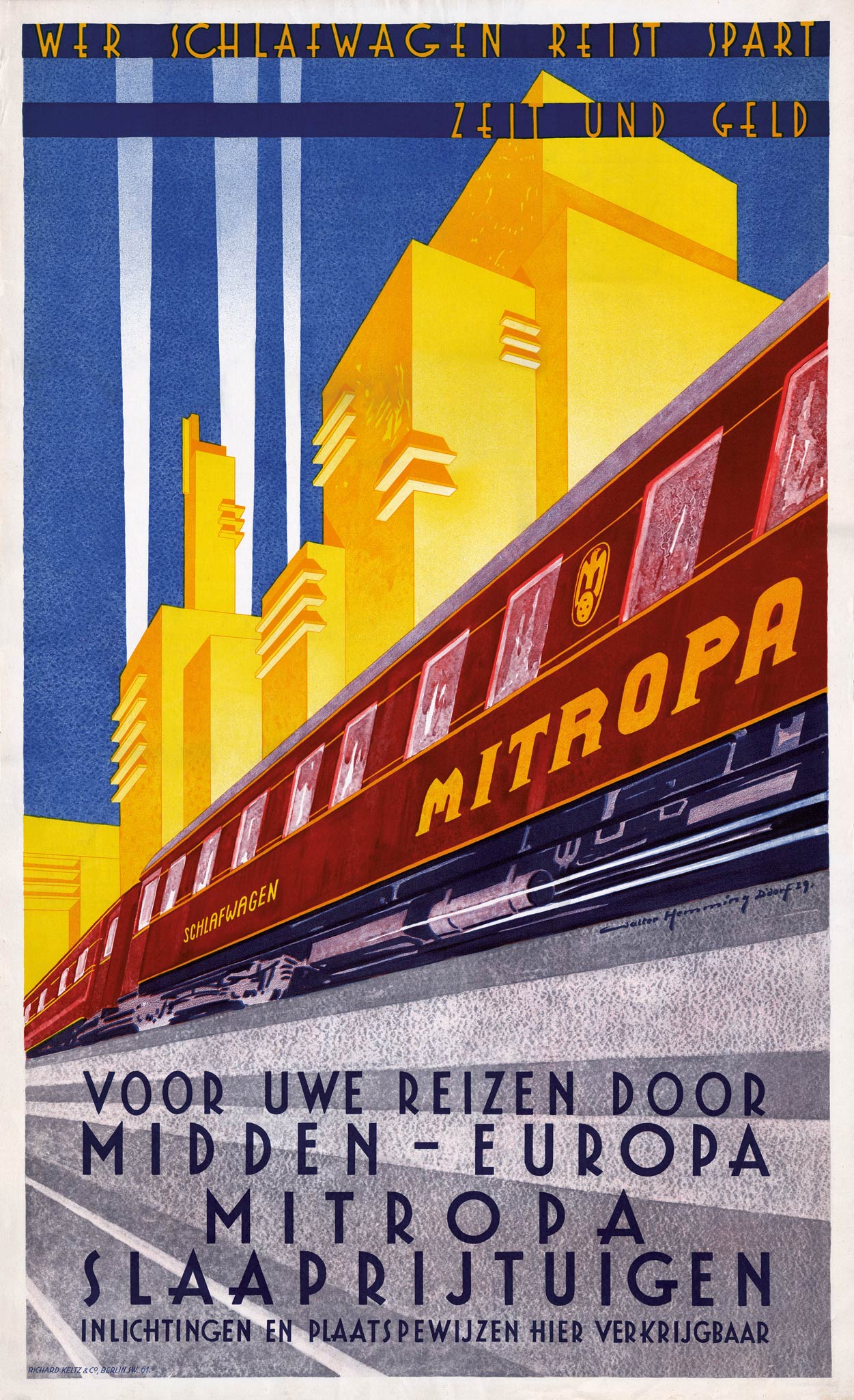
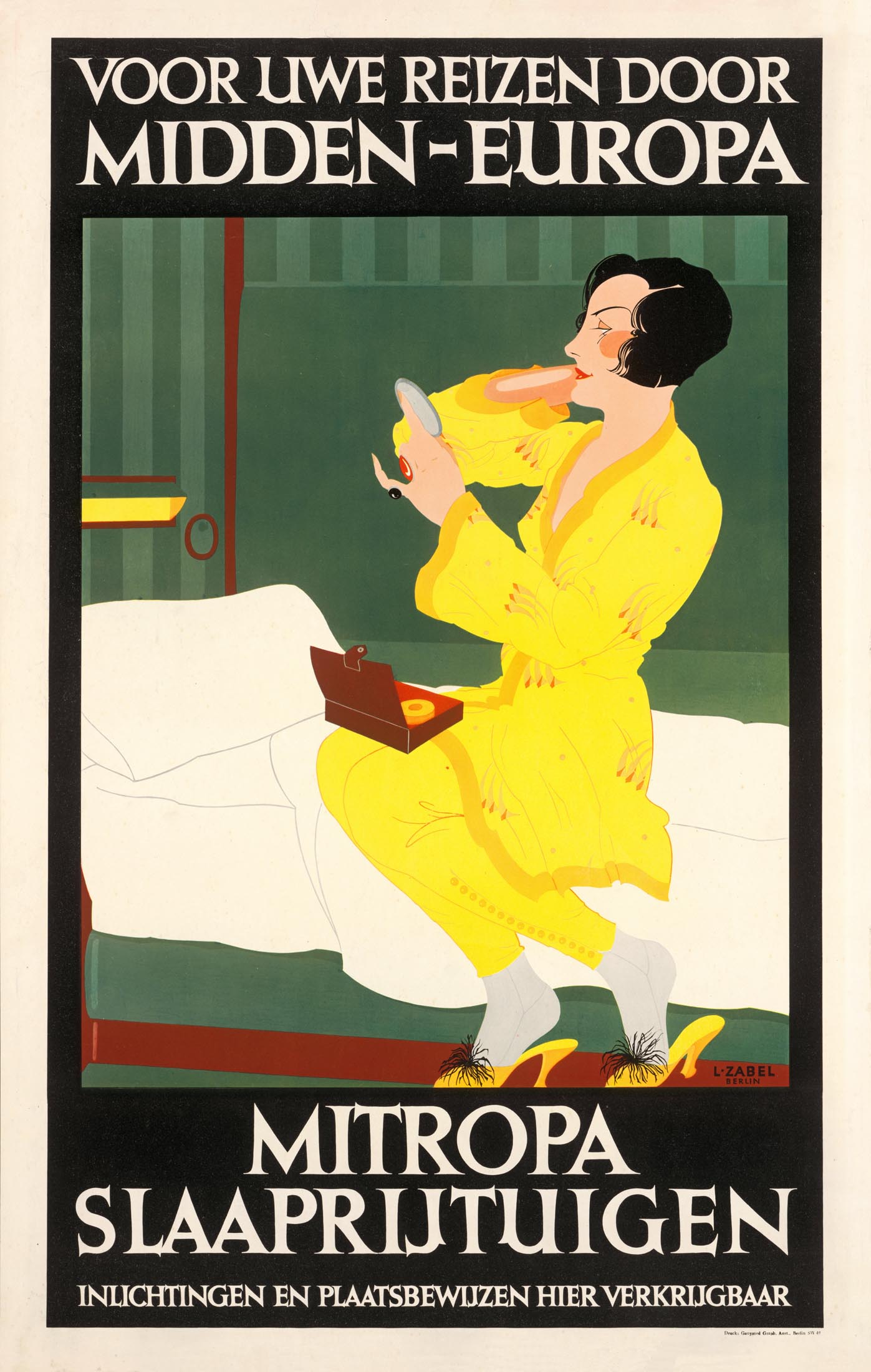
To mark the new fleet Mitropa released two posters. In 1928 Lucian Zabel depicted an elegant lady taking care of her make-up in a sleeping compartment. Zabel applied the typical German 'Plakatstil' with simple shapes, flat areas of color and striking letters. The poster was issued in several languages. The original text 'Wer Nacht reist spart Zeit und Geld' became 'For your travels through Central Europe'. On a poster by the German painter Walter Hemming (1894-1979) the burgundy sleeping cars ran almost diagonally across the image against a backdrop of strongly stylized buildings in matching yellow. At the top is a German text that states that those who travel by sleeping cars save time and money. The bottom part could be printed in different languages.
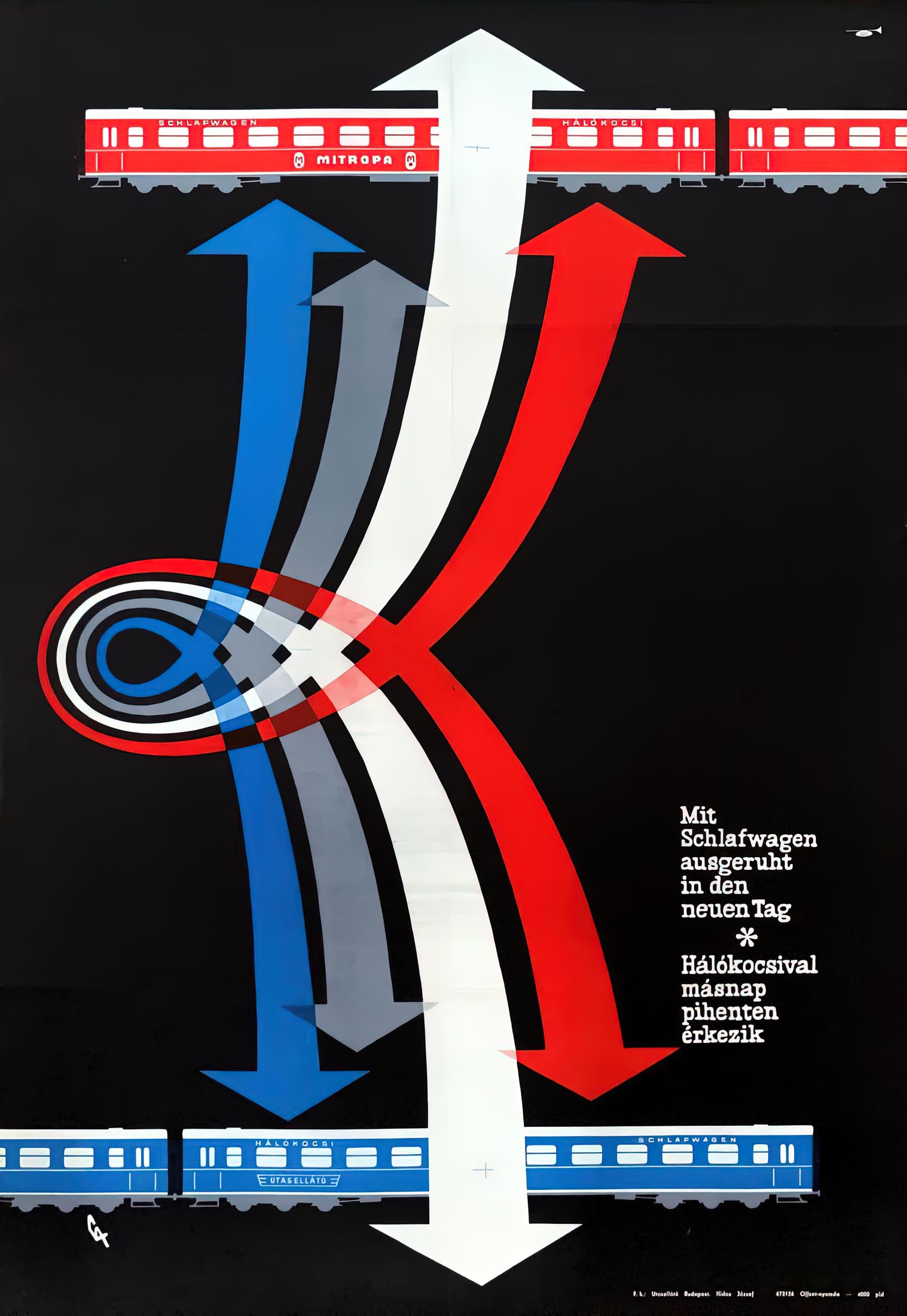
After the Second World War, Mitropa would be divided in two, like Germany itself and the German railways would. In East Germany (GDR) the pre-war name was retained and Mitropa was one of the few shareholder companies. A Hungarian sleeping car poster from 1967 shows that Mitropa collaborated with Utasellátó, the passenger service of the Hungarian railways. In West Germany the Deutsche Schlafwagen- und Speisewagen Gesellschaft (DSG) was founded. The Mitropa past remained visible in the logo and color of the carriages. The companies were reunited in 1990, but soon after Mitropa fell apart into companies with different names.
Train bleu
Since 1886 the Méditerrannee Express had connected Paris with the Côte d'Azur. It was a luxury train, only consisting of Wagons-Lits sleeping and dining cars. Initially these were made of teak, but in 1922 new steel S-cars were introduced. Because of their dark blue livery the train was soon nicknamed 'Train Bleu' (from 1947 its official name). The blue coincided nicely with the color of the Méditerrannee. The name also caught on with the English clientele, as illustrated by the slogan 'Summer on the French Riviera by the Blue Train'. For British tourists a train segment already started from the Gare Maritime in Calais. The Train Bleu left Paris early in the evening, to arrive the next morning in Marseille, Saint-Raphaël, Juan-les-Pins, Antibes, Cannes, Nice, Monte-Carlo and finally Menton at the Italian border.
From 1928 onwards the Train Bleu featured even more comfortable carriages of the LX type. The L stood for luxury and the X for the 10 spacious sleeping compartments in each carriage. The luxurious ambiance and fashionable destinations attracted celebrities including Charlie Chaplin, Coco Chanel, Winston Churchill and the writers F. Scott Fitzgerald, Evelyn Waugh and Somerset Maugham. Agatha Christie published her detective novel The Mystery of the Blue Train in 1928.
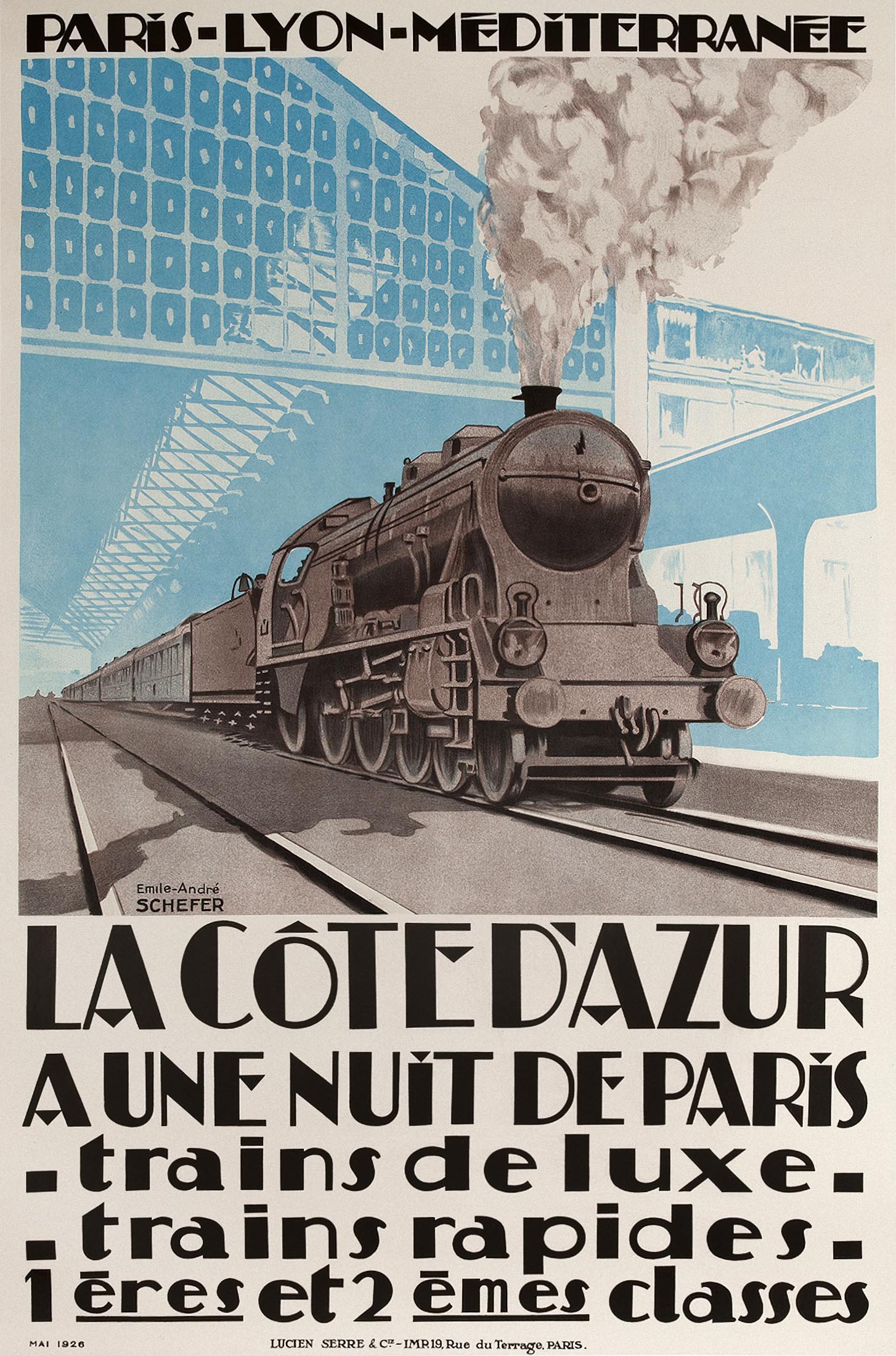
A 1926 poster by Emile-André Schefer (1896-1942) did not yet mention the Train Bleu name, although the use of color was a hint. Together with the luxury train, the poster also advertised regular express trains to the Côte d'Azur of the Paris-Lyon-Méditerranée (PLM) railway company. Schefer specialized in drawing and painting trains for posters, railway magazines and educational children's books. He co-founded the French 'railway friends' AFAC and after his death the Prix Schefer was established for the best railway painters.
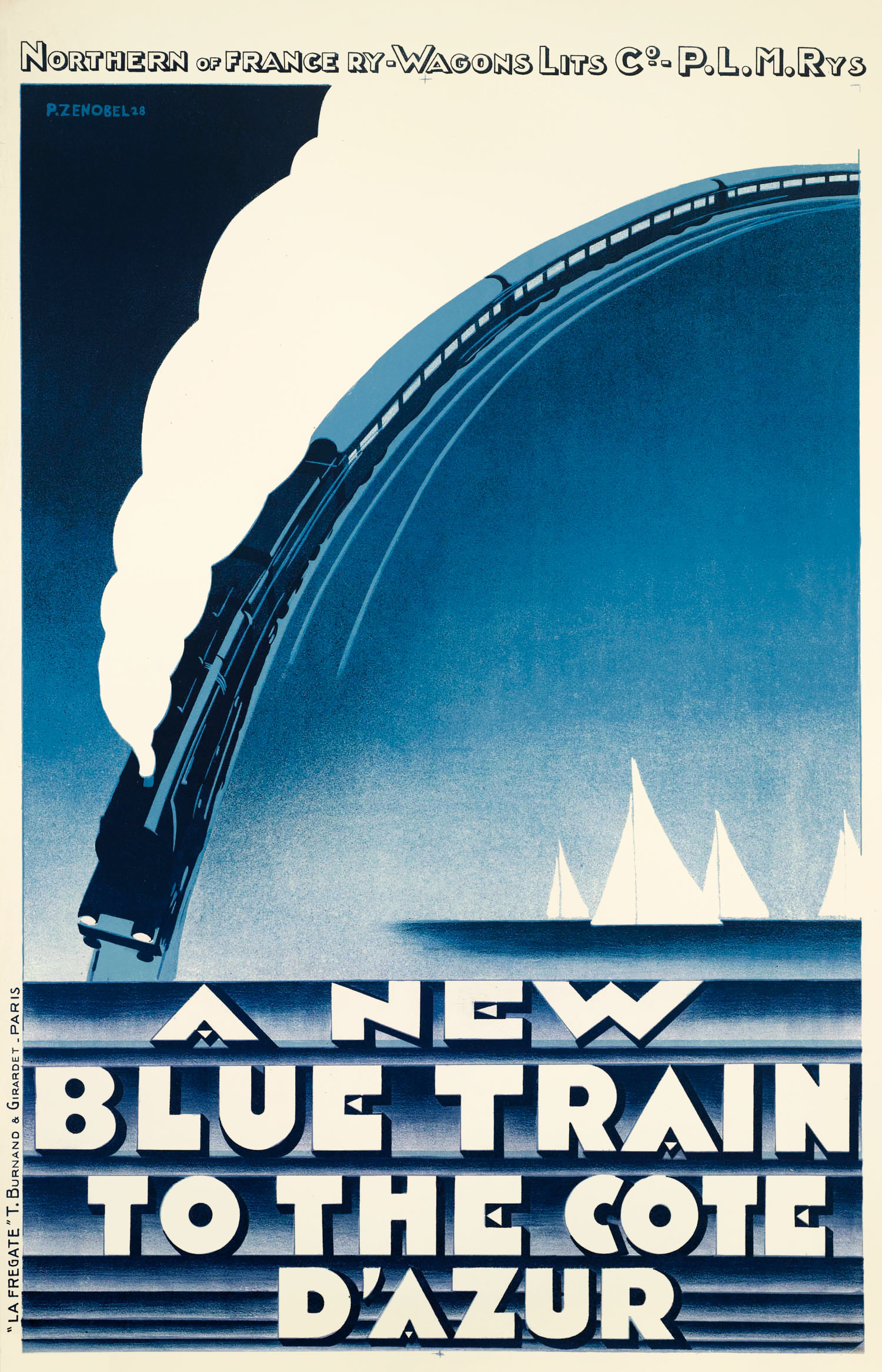
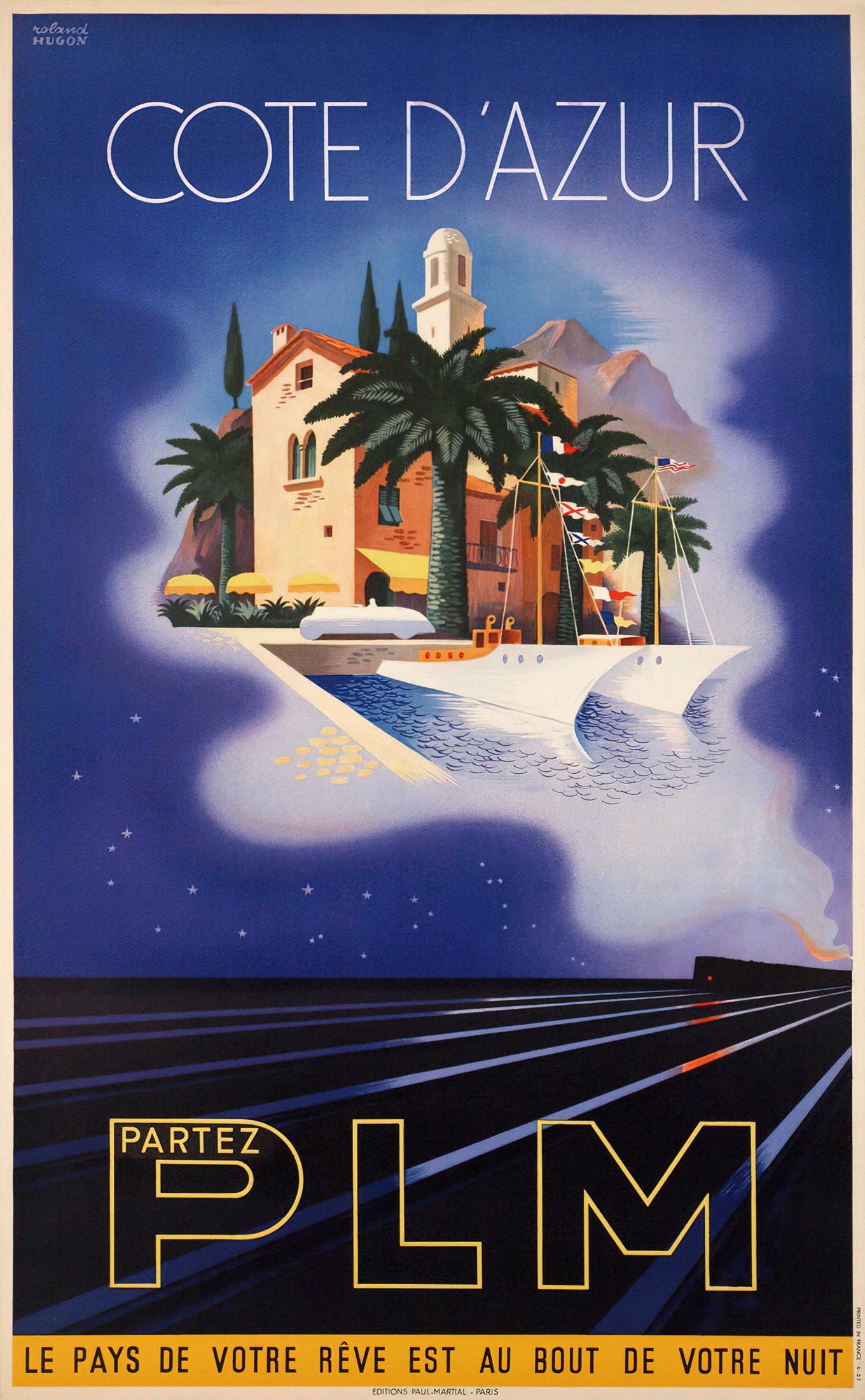
Pierre Zenobel (1905-1996) only needed one color for his poster A new blue train to the Côte d'Azur, which marked the arrival of the LX carriages in 1928. The blue at the top left is the color of the night, while it represents the Mediterranean at the bottom right. Zenobel was also a decorator and painter of still lifes and landscapes. In 1937 Roland Hugon (1911-?) made another beautiful PLM poster, on which the Côte d'Azur appears in a dream in the steam cloud above the tracks. It was one of the last PLM posters; the next year the company would become part of the SNCF, for which Hugon would design winter sports posters.
Night Scotsman
The popular name Flying Scotsman also became the official name of the express between London and Edinburgh in 1924. The London and North Eastern Railway (LNER) train service on the East Coast Main Line departed every morning at 10 and took approximately 8 hours. But there was also an overnight train, called Night Scotsman, departing around 11.30 in the evening.
The night train had no fewer than 14 carriages, half of which were first and third class sleeping cars. Competitor London Midland & Scottish Railway (LMS) also had an overnight train to Scotland, via the West Coast Main Line. Both services were promoted jointly on one of three posters that appeared in the Quad Royal (large landscape) format in the early 1930s.
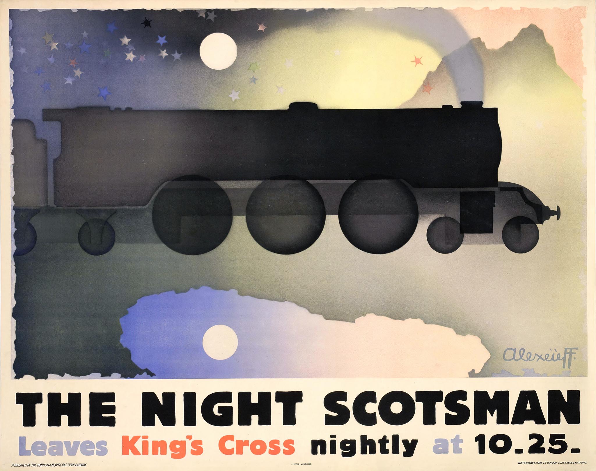
Alexandre Alexeïeff, who had fled from Russia to Paris, was not only a designer and illustrator, but also a pioneer of animation films. On his posters for the LNER he created an almost surrealistic world. For the Night Scotsman Alexeïeff painted a floating locomotive under a full moon, reflected in a lake.
The fairytale scene is executed in transparent tones reminiscent of his later animation films, such as Sleeping Beauty and Die Nacht auf dem Kahlen Berge with music by Modest Mussorgsky. Another version of the poster with the text 'To London by sleeper' promoted the train in the opposite direction.
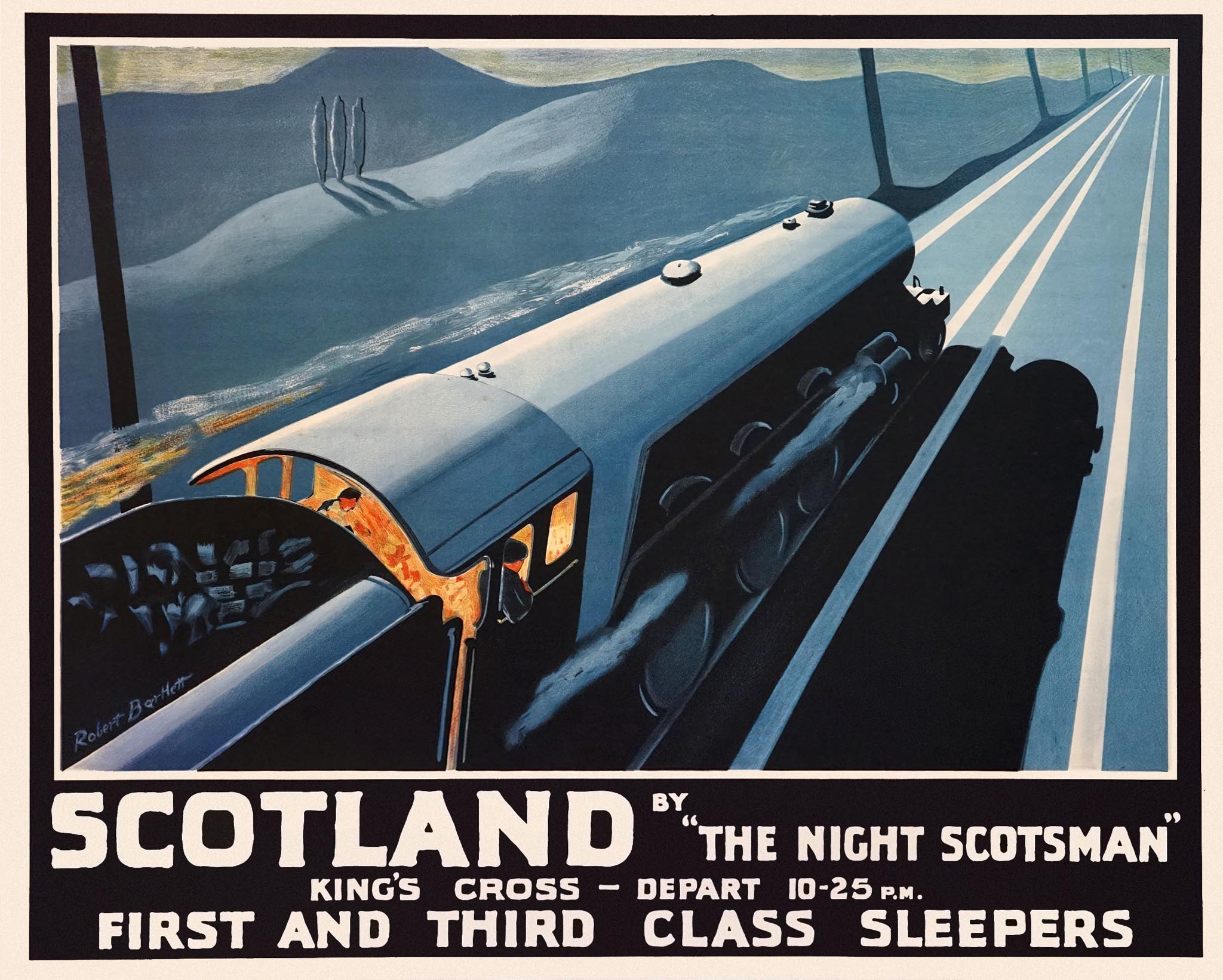
Although less dreamlike, Robert Bartlett (dates unknown) also managed to make a successful poster for the Night Scotsman in 1932. A steam locomotive runs through a moonlit nightscape, while the driver and fireman on the footplate stoke the fire for the travelers to arrive in Scotland the next morning.
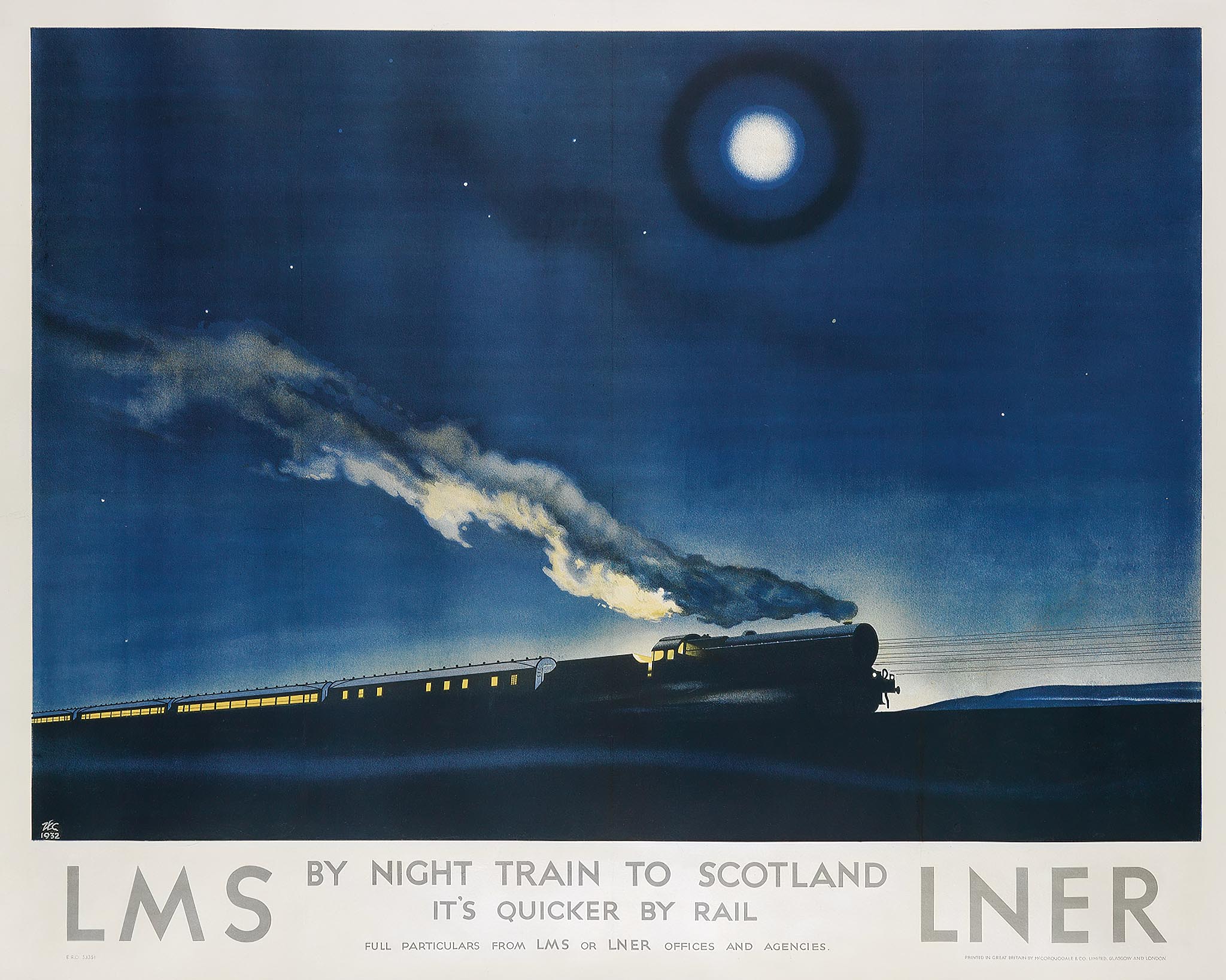
Philip Zec created the joint poster By Night Train to Scotland for the LMS and LNER. The train speeds ahead under a glowing moon, the plume of smoke lit from below by the locomotive's fire. This nocturnal scene is an exception within Zec's oeuvre. He was best known for his political cartoons and propaganda posters during World War II.
Night Ferry
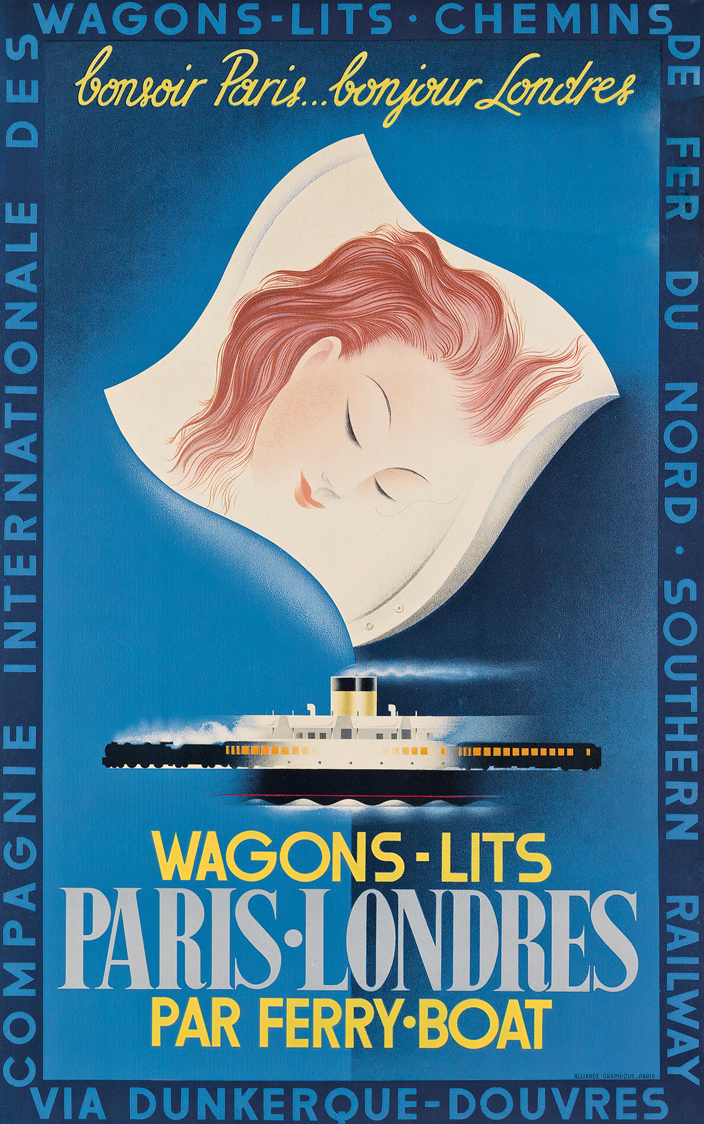
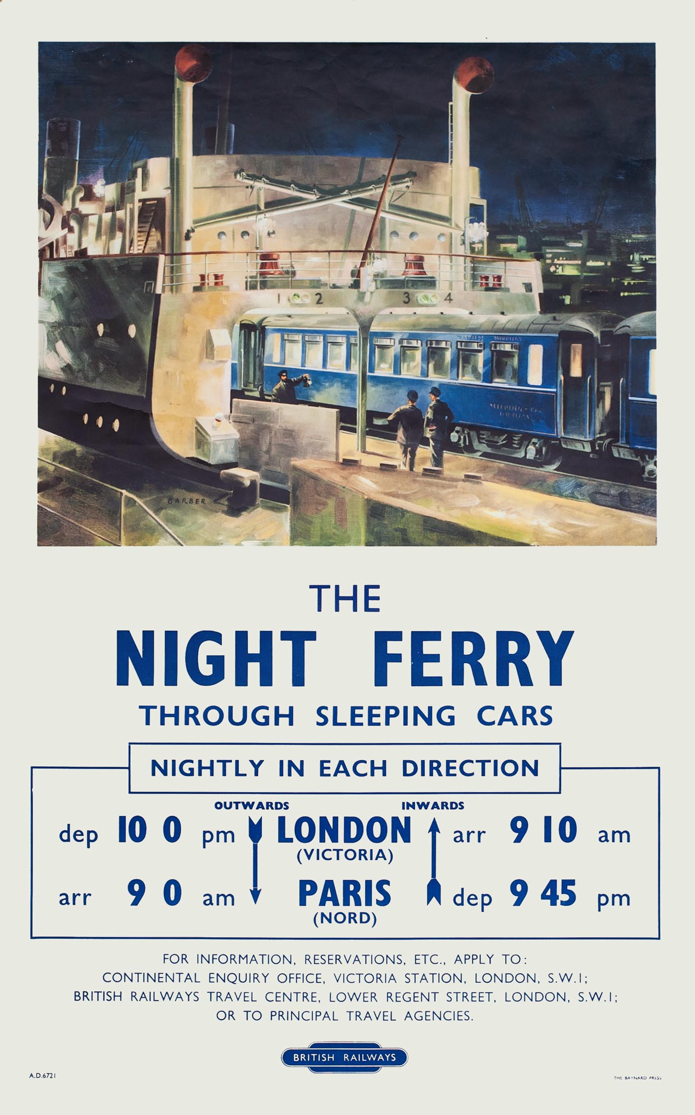
The only direct train between Paris and London that existed before the Channel Tunnel was the Night Ferry, inaugurated in 1936. In Dover the sleeping cars were driven onto a special ferry, to continue their journey at Dunkirk on the other side. Meanwhile the passengers could sleep on without interruption. The train departed from London Victoria around 10pm and arrived at the Gare du Nord at 9 the next morning. Travel times in the reverse direction were comparable. The Night Ferry was a collaboration between Wagons-Lits, Chemins de fer du Nord (soon SNCF) and Southern Railway (later British Railways).
'Bonsoir Paris, Bonjour Londres' was the appropriate caption on Paolo Federico Garetto's (1903–1991) poster for the introduction of the 'ferry-boat'. The same designer created a brown-colored variant for the Southern Railway, on which the sleeping lady was replaced by two large eyes. In one eyeball London by night was reflected and in the other one the Eiffel Tower. Garetto, originally from Italy, started his career as a cartoonist and also designed covers for Vanity Fair. In addition to the French railways he designed posters for Air France and the Italian Line shipping company.
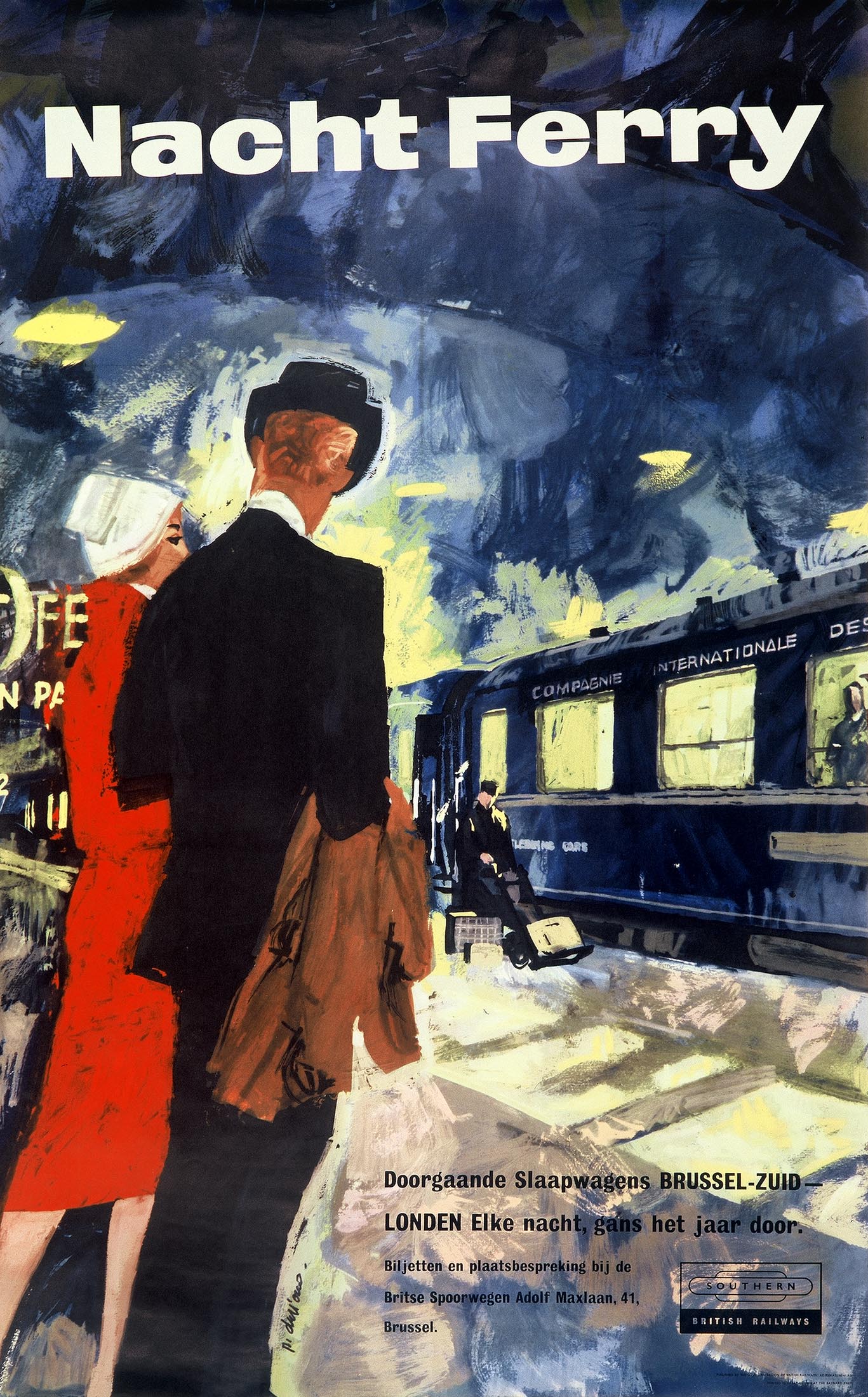
During World War II the Night Ferry was abolished; service could not be resumed until 1947. Ten years later Brussels was added as a direct destination, with through-carriages that branched off at Lille. In 1959 the Southern Region of British Railways released a picturesque poster made by P. Dull'ous. It was published in three versions with different captions: Night Ferry, Ferry du Nuit and Nacht Ferry. The latter had small print in Dutch: 'Direct sleeping cars Brussels South - London. Every night, all year round.' In 1980 the Night Ferry was discontinued due to the rise in air traffic.
Wagons-Lits 'Touriste'
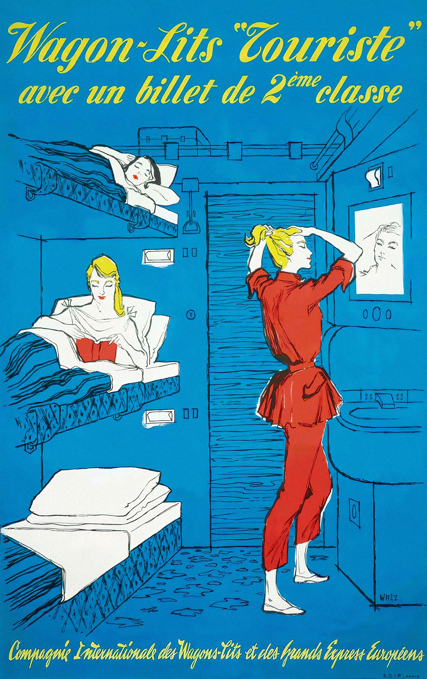
After the damage caused by World War II was repaired, European society became more egalitarian. More and more 'ordinary' people wanted to go on holiday abroad. The era of luxury trains with exclusively Wagons-Lits carriages was over. Sleeping and dining cars still continued to run in regular international trains. Wagons-Lits had to adapt and introduced a tourist class.
The new class had three-bed compartments instead of the usual one or two. In addition to the new Type U (Universal) sleeping cars the company introduced a futuristic inox (stainless steel) design, named Type P after its designer M. Pillepich. Over two levels these contained 20 single compartments with washbasins. The dark blue sleeping cars of pre-war design still remained dominant, though.
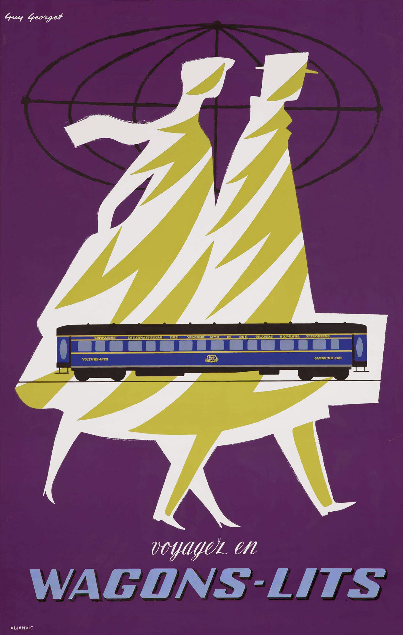
From 1950 onwards Wagons-Lits issued many posters to win back customers and to reach new target groups. Typical for its time is a purple poster by Guy Georget (1911-1992), which resembles the cover of a detective pocket book. Georget had been artistic director at a publishing house. From the late 1940s he designed many posters for the Spanish tourism office, Philips, French railways and especially Air France.
On Georget's purple poster the French wording 'Wagons-Lits' seems like a general advertisement for the company of the same name, but the poster was specifically about sleeping cars, as is evident from the English version featuring the text 'Travel by Sleeping Car'. The oval windows in the doors of the depicted sleeping car reveal that it was a specimen of the luxury LX type with ten compartments.
Designer Jean Don (1900-1985) was born in Bucharest. Between the two World Wars he had mainly created posters for casinos in Deauville, Cannes and La Baule and for balls and galas in Paris. A bit of frivolity marked his post-war designs for Wagons-Lits too, for example a juggling waiter on a dining car poster.
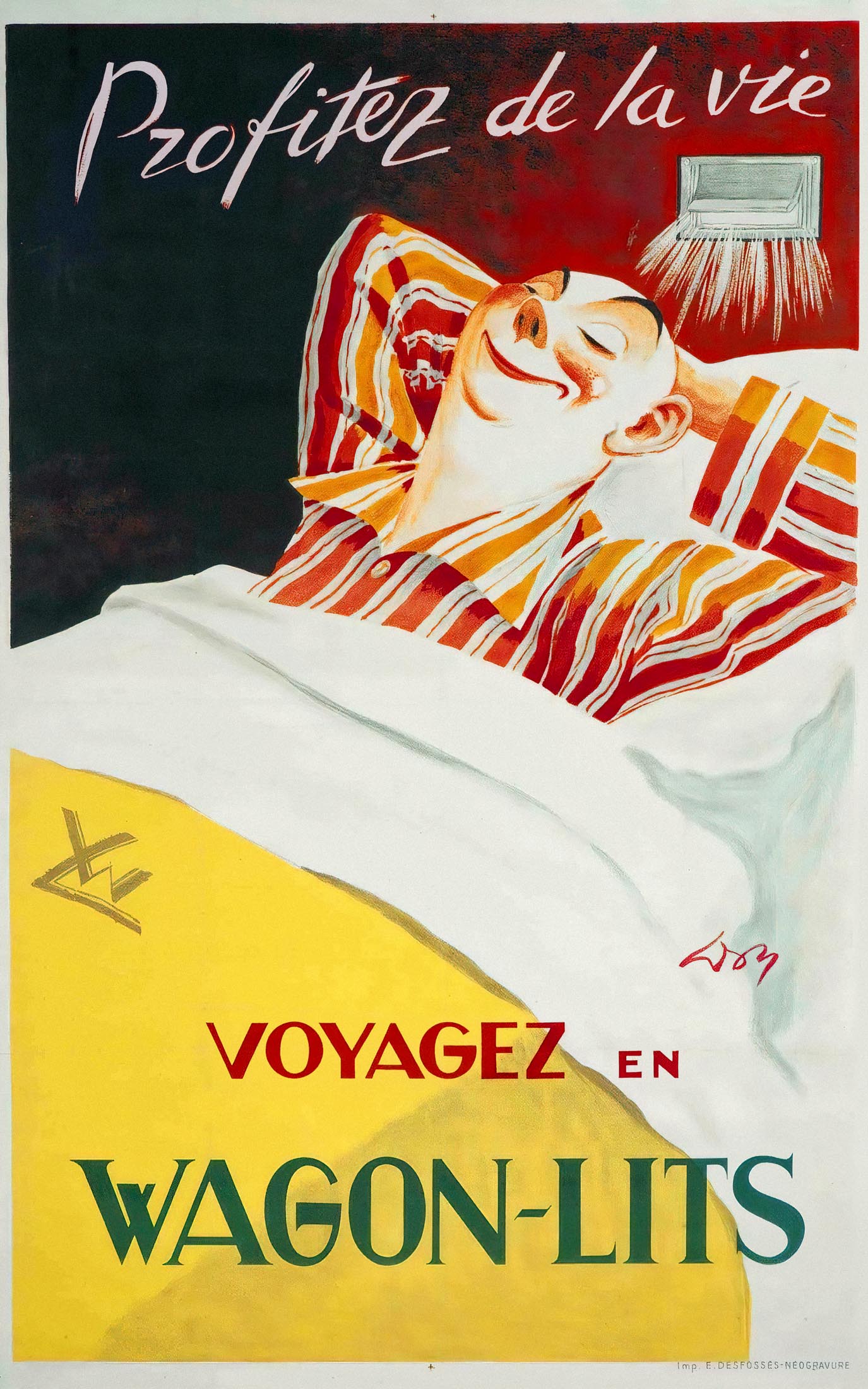
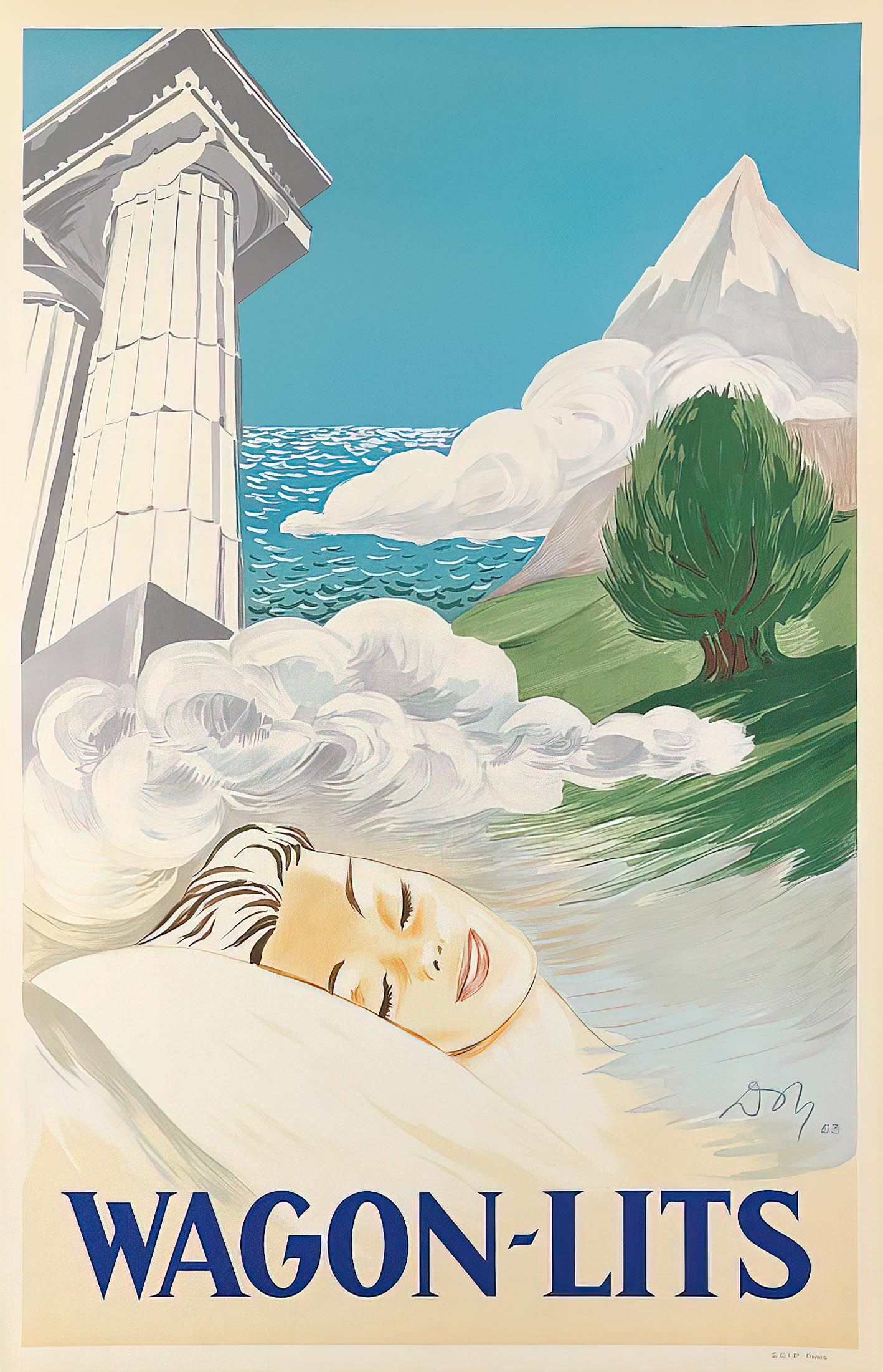
In 1953 Don created two posters for sleeping cars. Remarkably, he represented a man in pyjamas as a mere caricature, but not the sleeping woman on the 'sister poster'. She seems to be dreaming of a breezy awakening along the Mediterranean. To the 'male' poster the text 'Profitez de la vie' (enjoy life) was added.
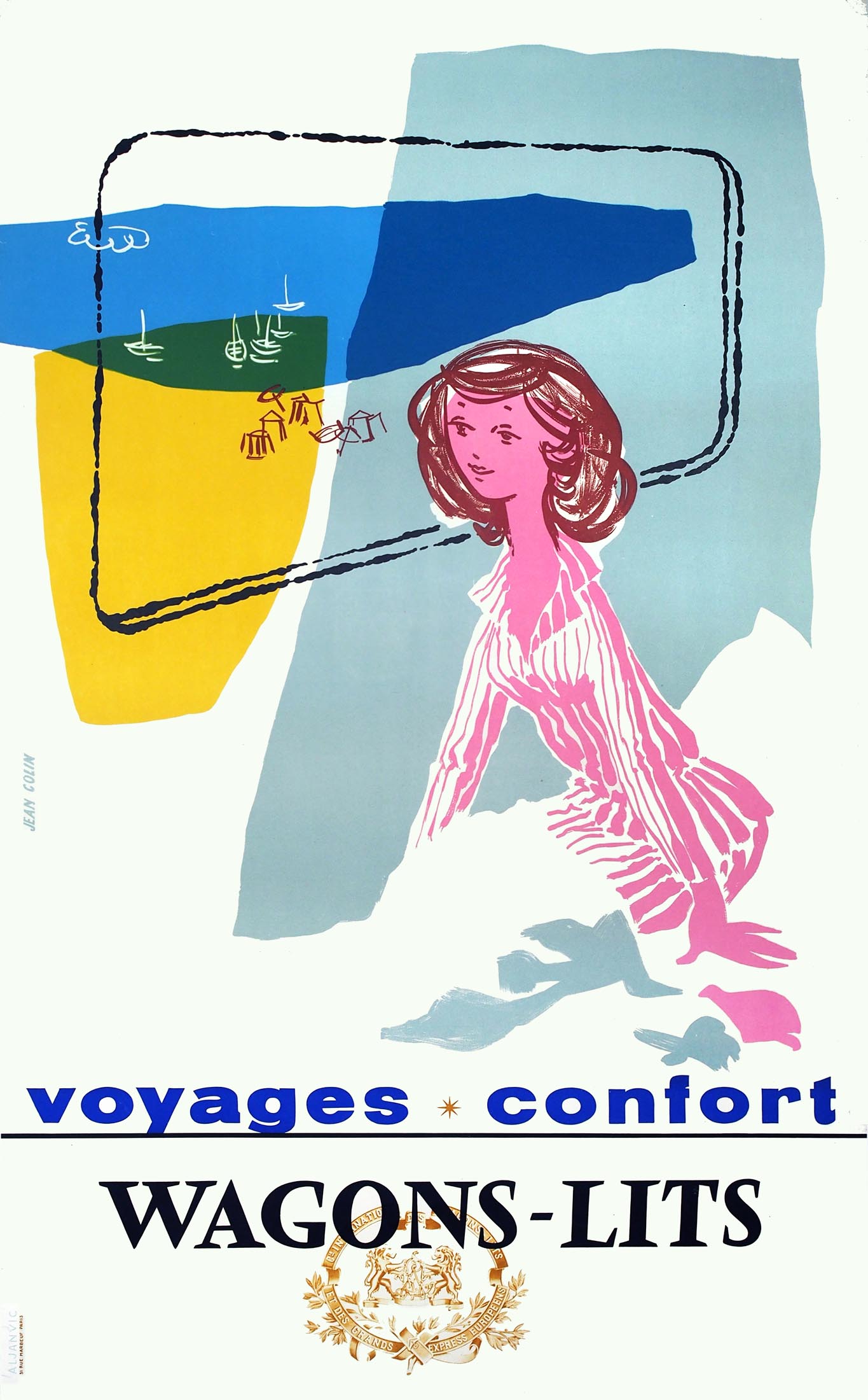
The poster that Jean Colin (1912-1982) created a few years later resembles Jean Don's, except that the woman is awake and looking outside. Also the drawing style is much more sketchy. Colin was one of the founders of the Alliance Graphique Internationale (AGI) and designed about 300 posters, for Shell and Pernod for example. His charming style appealed to a wide audience. In 1959 he won a gold medal for the best French poster.
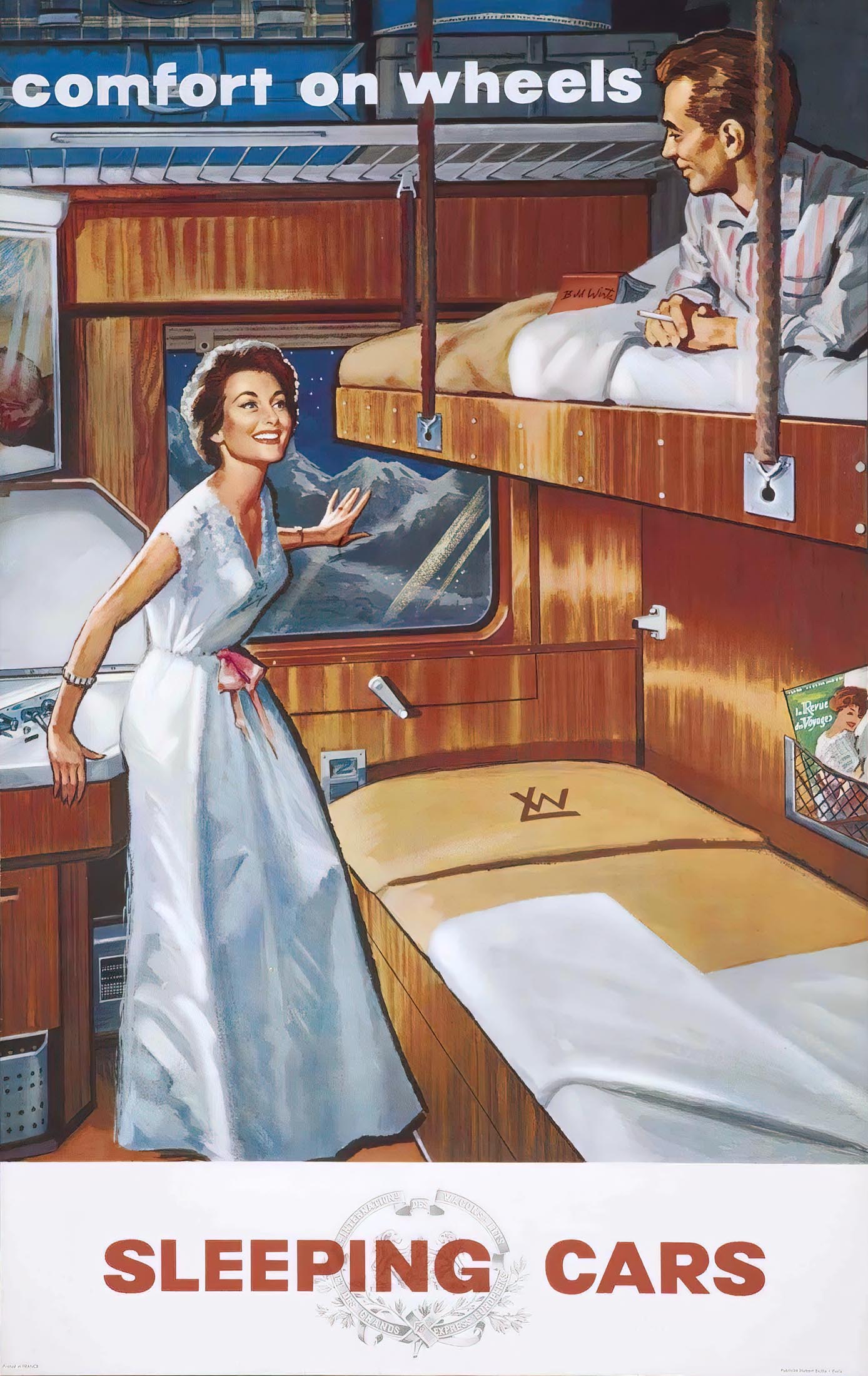
The background of Bill Wirts (1917-1962?) is unknown, but until around 1950 he was working in the United States as an illustrator of western books and family magazines. He then settled in France and specialized in the visual combination of women and transport. He illustrated posters and calendars for Vespa and Duomatic bikes and designed ads for Renault Dauphine and Simca Vedette cars. In the late 1950s he created a Wagons-Lits poster of a couple in a sleeping compartment.
Couchette cars and holiday trains
After Wagons-Lits' tourist class, French and German railways came up with an even more economical solution: couchette cars. These had six berths per compartment, three above each other. The Dutch Railways (NS) also had couchette cars built in 1958, called Plan N. Each carriage contained 10 compartments for 6 people. Because of the shared space couchettes offered little privacy, except for large families. To distinguish them from 'real' sleeping cars, those with couchettes were called bunk cars (Slaaprijtuig vs. Ligrijtuig in Dutch, Schlafwagen vs. Liegewagen in German, Voiture-lits vs. Couchettes in French).
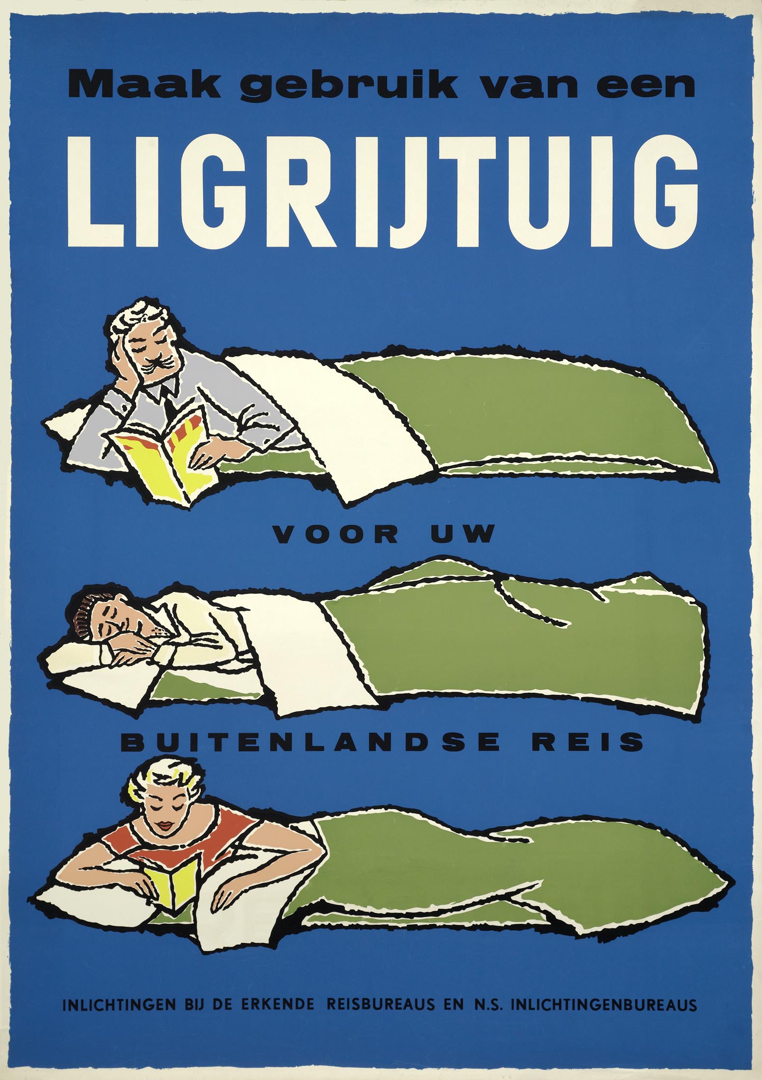
To promote the new cars, NS published the poster 'Make use of a couchette car for your foreign journey'. The three reclining persons were given a bit more space than what the six-person couchettes offered in reality. The blue background was the same as the exterior color of the carriages. The style of the poster is reminiscent of the ones that Raymond Savignac created for the French railways (SNCF), but most likely the design came from the regular NS advertising artist Jan de Haan (1917-1975).
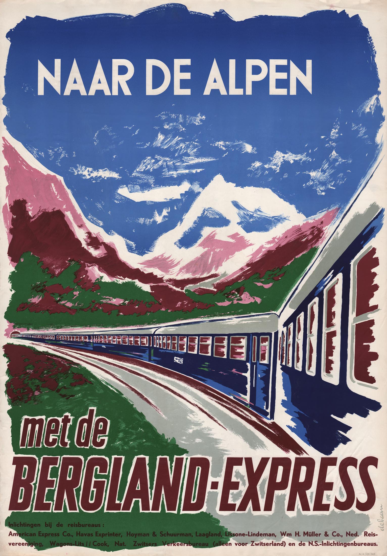
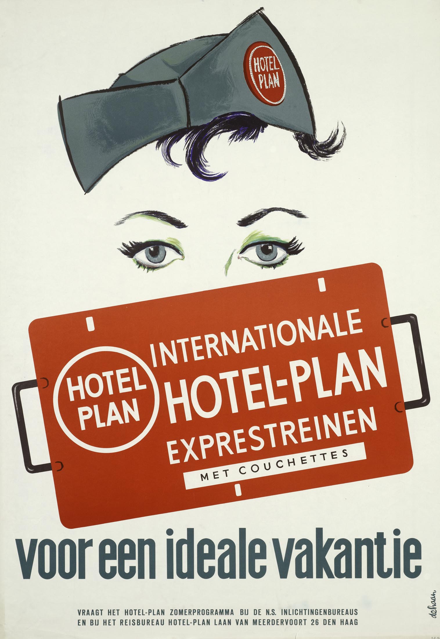
The NS couchette cars were also used in holiday trains to the Alps and the south of France. More and more Dutch families were able to travel thanks to affordable all-inclusive holidays by coach or train. Travel agencies operated special holiday trains to popular destinations, such as the Hotelplan Express, Bergland Express and Zon Express. These charter trains were not part of the regular timetable. 'Tourist is real winner in competition between rail and bus', wrote newspaper Het Parool in 1953.
While the Hotelplan Express was recognizable by the logo of this tour operator, the Bergland Express was fitted with neutral signs. This holiday train was a collaboration of ten tour operators, including Nederlandse Reisvereniging (NRV), Lissone-Lindeman and Wagons-Lits/Cook. 'Fast and comfortable to the Alps', was the slogan of the Bergland Express. The destinations were mainly in Switzerland (Basel and Lucerne) and Austria (Salzburg).
1000 km in one night
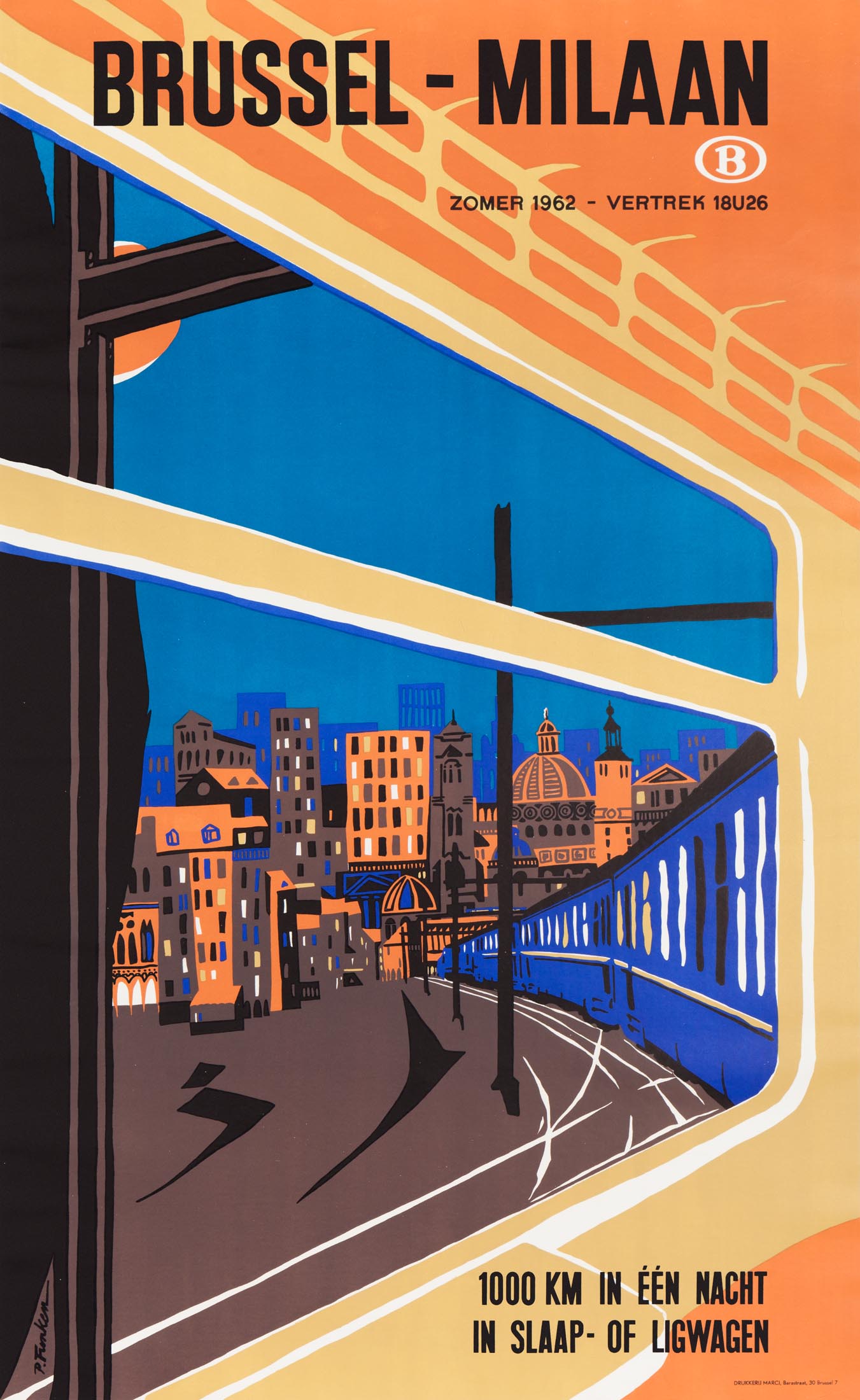
In the 1960s the Belgian railways (SNCB) often used the slogan '1000 km in one night with a sleeping or couchette car'. Posters promoted train journeys from Brussels to Milan, Salzburg, Copenhagen and the 'Azurenkust' (Cannes, Nice and Menton). For travelers who wanted to take their automobile on holiday, the 'auto-nachtexpres' (car sleeper express or Motorail) ran to Narbonne, Avignon, Munich and Milan, with connections to Rome, Brindisi and Greece. In contrast to other railway companies. SNCB jointly advertised sleeping and couchette cars, i.e. both carriages with private compartments and with 6-person couchettes.
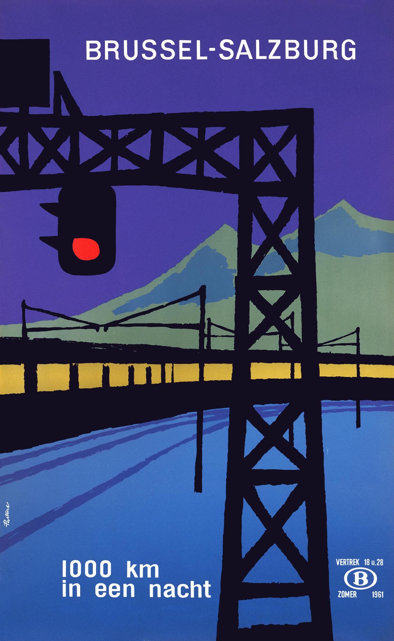
The posters were created by regular SNCB designers Paul Funken and André Pasture. Funken (1932) was an architect and furniture designer by origin. The illustrations on his first railway posters consisted of flat surfaces in warm colors, such as purple and brown, which suited the cozy atmosphere of night trains. French-born André Pasture (1928-2006) graduated from the Royal Academy in Brussels in 1949 and contributed to the design of the Expo 58 world exhibition. Subsequently he designed many posters for the Belgian tourism commission and especially the railways.
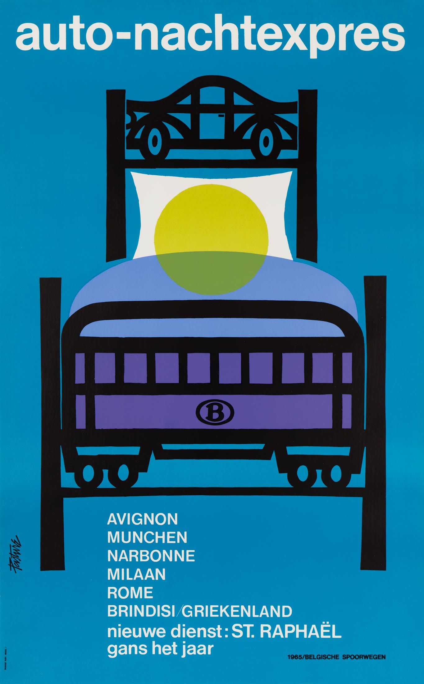
Pasture's designs were abstracted representations of a carefully selected object or symbol. For the Auto-nachtexpres this was a bedstead with a car in the headboard and a train carriage in the foot end. His style became more and more minimalist, combined with the new font Helvetica.
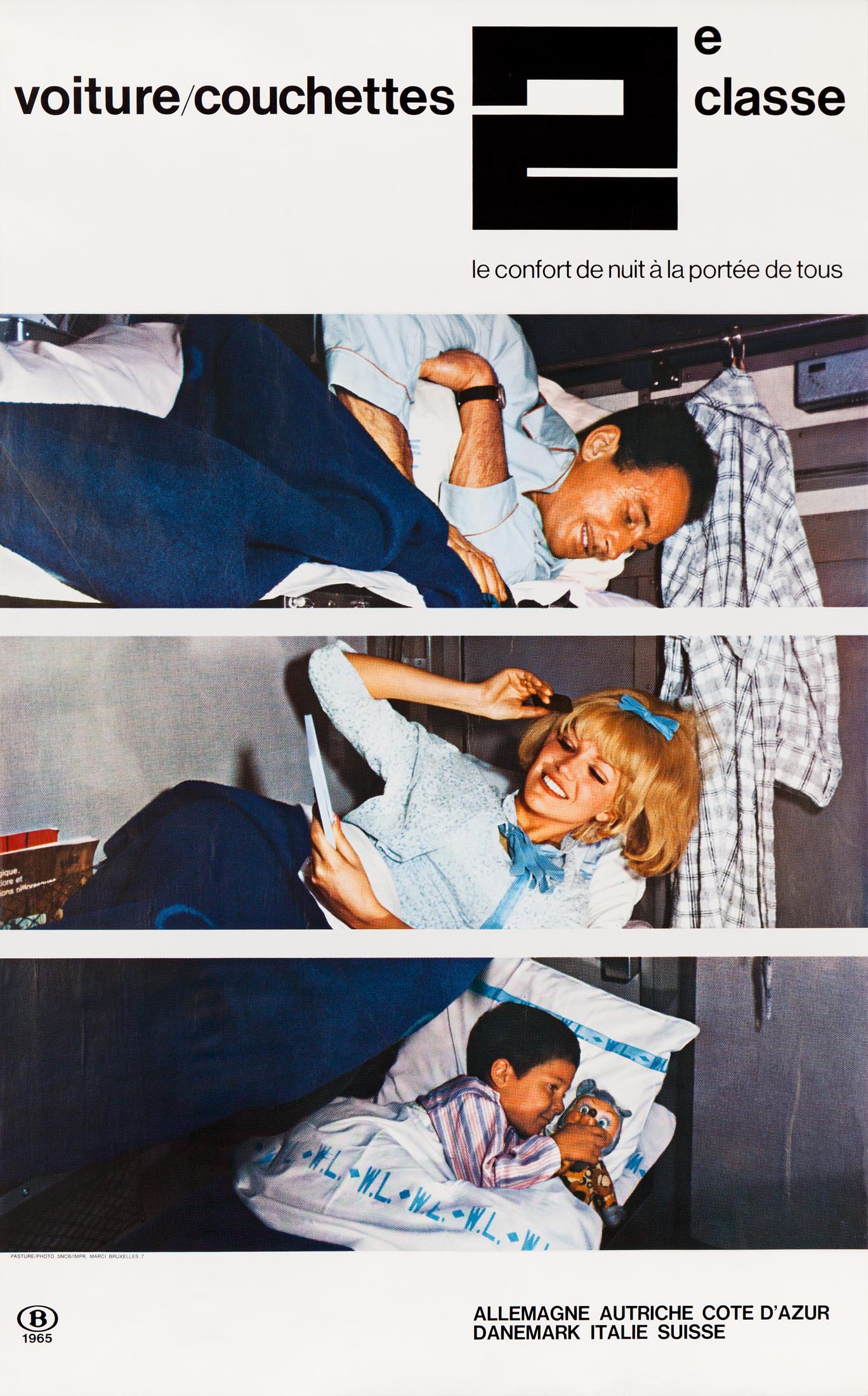
In 1965 Pasture received an award at the International Poster Biennale in Warsaw for the poster '500 km by night train via Paris'. In the same year Pasture also made a poster with color photographs, taking a further step back as a designer. The three photo strips effectively illustrated the three couchette births on top of each other.
Une nuit en voiture-lit
Around 1970 the French national railways (SNCF) published posters that focused on sleeping women. They not only referred to night trains, but in an implicit way also to eroticism. A poster of a girl with blond locks of hair and large eyelashes featured psychedelic colors and shapes from the youth culture of the time.
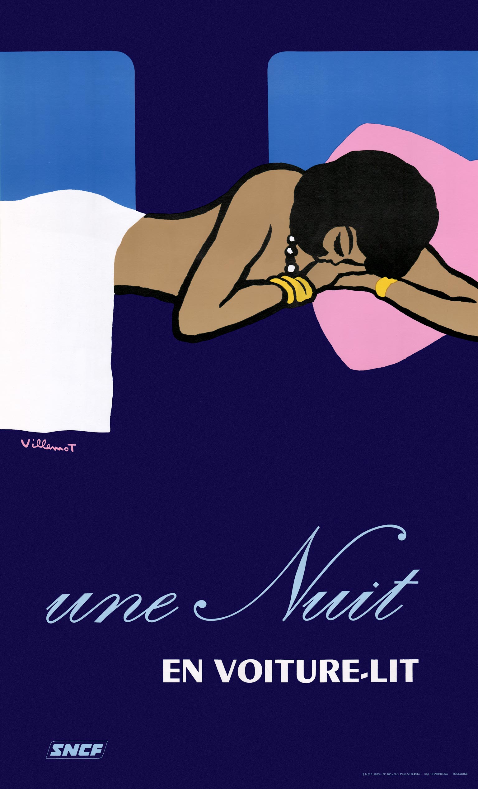
A few years later designer Bernard Villemot opted for a woman with light brown skin and dark hair. Did he refer to legendary trains with exotic destinations such as the Orient Express, or was it just a sign that the population was becoming more diverse? Villemot was known for his loosely sketched posters for Orangina, Perrier, Bally shoes and Bergasol sun cream on which he often depicted women in different shades of brown and black, just as the bathers on his SNCF poster for the Côte d'Azur.
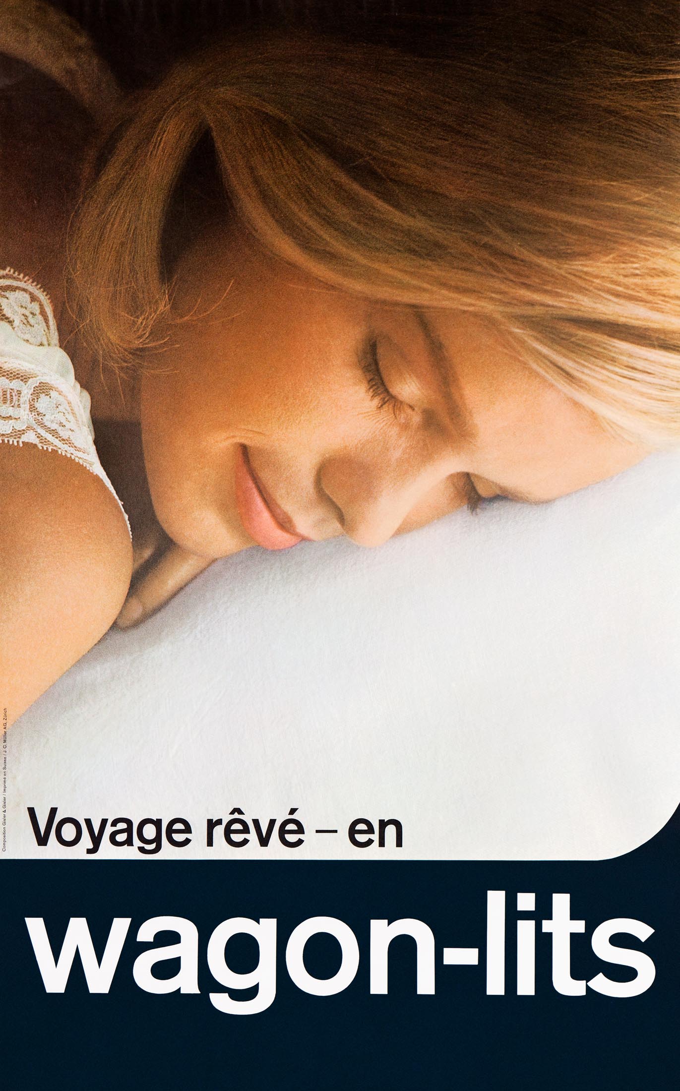
In the late 1960s the Swiss advertising agency Gisler & Gisler had already created a photo poster with a close-up of a sleeping blond woman. It was used by railway companies all over Western Europe with texts in several languages, such as 'Voyage rêvé — en wagons-lits' and much more prosaic: 'Win a day — take the sleeping car'.
Trans Euro Night (TEN)
In 1971 nine European railway companies formed a pool (joint stock) of sleeping cars, called Trans Euro Night (TEN). All existing sleeping cars were added, including those of Wagons-Lits and the Deutsche Service-Gesellschaft (DSG), the West German successor to Mitropa. Due to the changing market these once renowned companies were no longer able to afford innovations. From then on railway companies ordered new carriages themselves, while the existing Wagons-Lits and DSG sleeping cars were leased or taken over. All were given a dark blue color and fitted with TEN logos.
From then on the sleeping car companies focused on their core activity: providing services to travelers in sleeping and dining cars. They continued to supply the staff, but no longer the carriages.
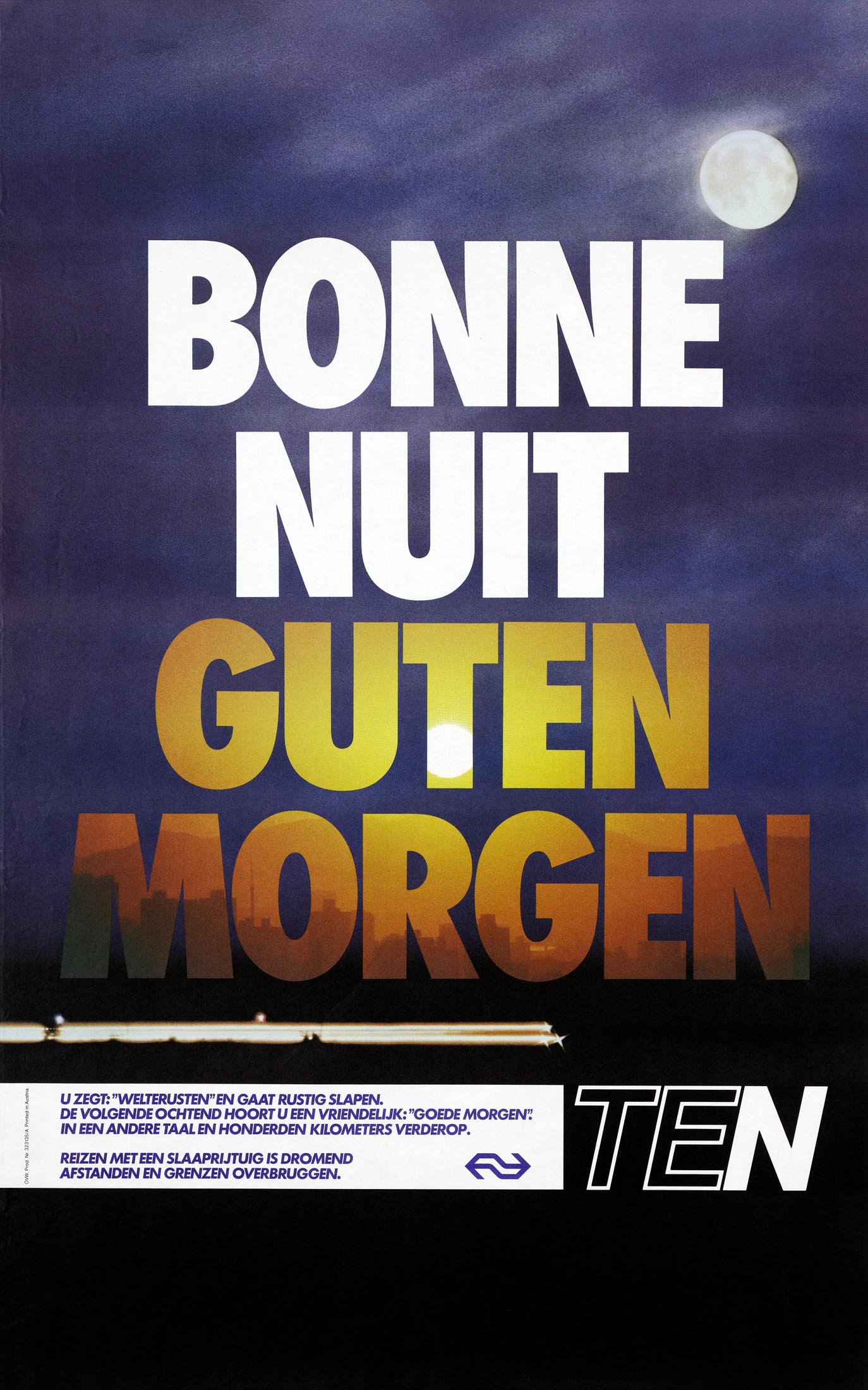
The name Trans Euro Night (called Trans Euro Nacht or Trans Euro Nuit in other languages) was reminiscent of the Trans Europ Express (TEE), but it was not actually related to this network of fast and luxurious day trains. The high quality of the TEE would never be matched by TEN. Trans Euro Night was advertised jointly — in several languages — as well as by country. Recurring elements were pillows and dark blue backgrounds, combined with slogans that mainly emphasized time savings. Around 1980 a poster design with a large rising sun by Vic Callaert, who worked for the Belgian railways, was used internationally in different languages.
'Traveling and dreaming in the sleeping car', read another TEN poster. In 1975 a columnist in a Dutch advertising trade journal mentioned this as an example of a slogan that was not lived up to. He had experienced the most sleepless night of his life: 'In that small, cramped room you are actually lying in a one-person horror cinema with a Surround effect… Those are the things you have to think about when you see two happily sleeping people on a poster. Truth in advertising?'
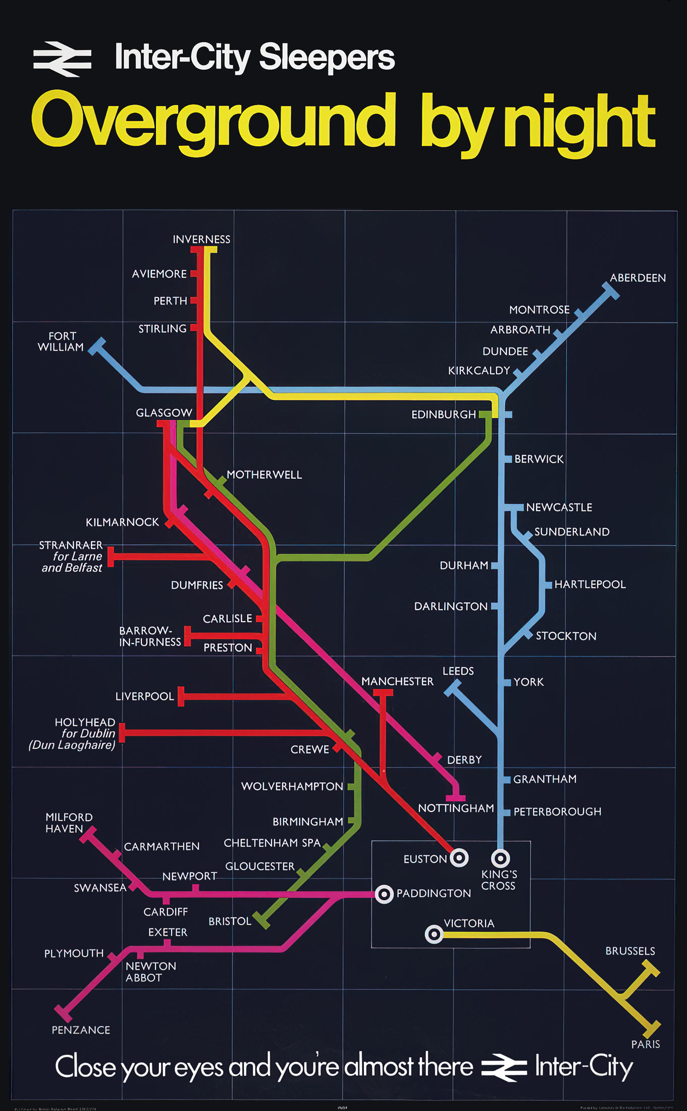
Inter-City Sleeper

Around 1970 British Rail (BR) renamed its domestic overnight trains to Inter-City Sleepers. Posters with metro-like maps showed how extensive the overnight network was. The routes were indicated in neon colors against a dark blue backdrop, like constellations in the sky. The East Coast line from London to Edinburgh and Aberdeen, and the West Coast line to Glasgow and Inverness, were the most important routes. Photo posters featuring sleeping travelers had slogans such as 'Inter-City Sleepers make the going eazzzzy' and 'Travel in your Pyjamas'.
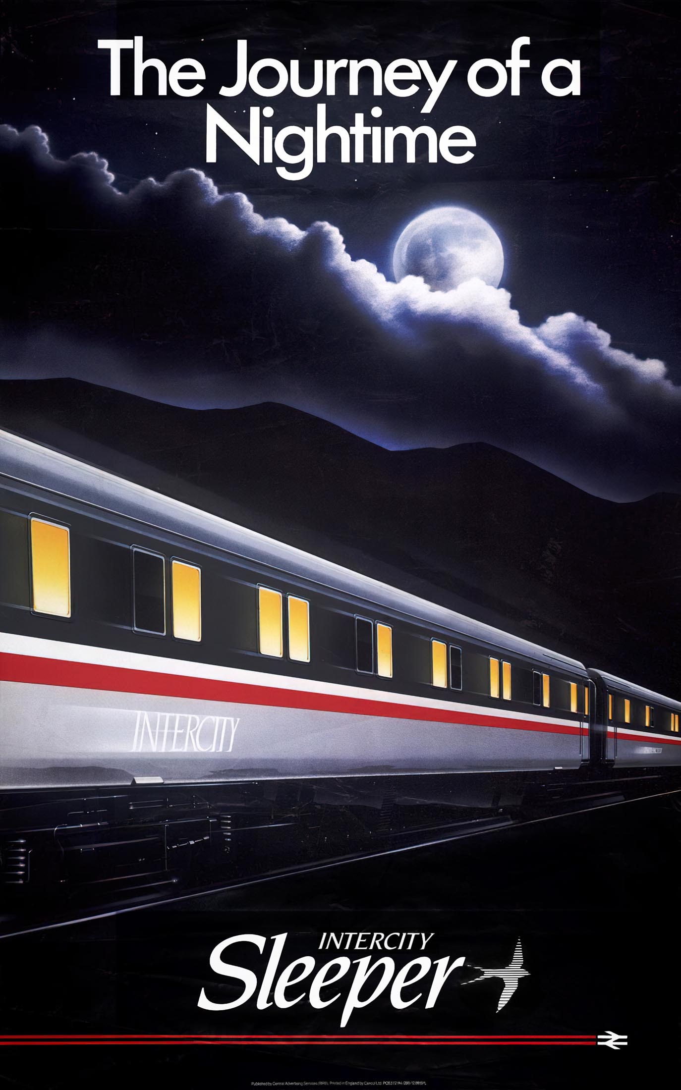
The approximately 30 sleeper connections in the United Kingdom around 1975 were halved in number a decade later. This was due to the growth of domestic air traffic and political pressure on British Rail to close unprofitable services. The old sleeping cars of the Mark 1 type, built around 1960, were replaced by modern Mark 3 carriages, called Sleeper Either class with Pantry (SLEP). The renewal was partly incited by a fatal fire in a sleeping car in 1978, which killed 12 people. The SLEP carriages were depicted on a poster with the slogan 'The Journey of a Nighttime'.
In 1985 the network's extent was still advertised as: 'InterCity Sleepers run every night from London to Scotland, the North East, the North-West and the West of England. Also Bristol/Birmingham to Scotland.' To make the overnight trains more profitable, saver fares were introduced and coaches with only seats added. However, the new clientele brought drunkenness and noise aboard, at the expense of the service's image. The East Coast sleeper was discontinued in 1988. The West Coast route was the only one that remained in service. It was taken over by ScotRail in 1995. This overnight train between London and Scotland still exists under the name Caledonian Sleeper.
Decline and Renaissance
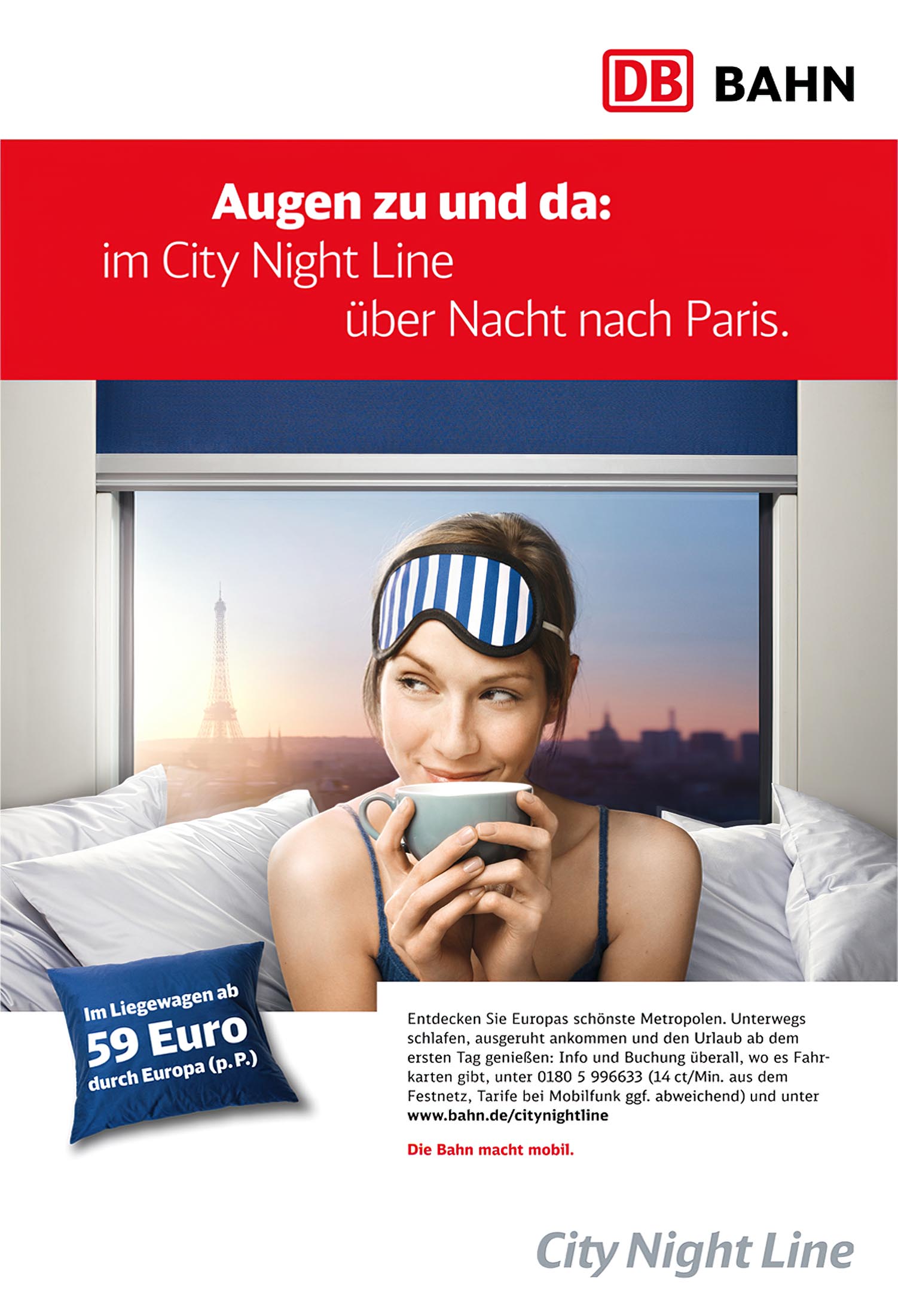
Sleeping car services declined at the end of the 20th century due to growing air traffic and the success of high-speed trains. In 1993 remaining continental services were grouped under the name EuroNight. Another part was continued by CityNightLine, a subsidiary of Deutsche Bahn (DB). NS Internationaal started the OverNightExpress between Amsterdam and Milan in 2000, which only ran for a year and a half. In 2009 the EuroNight 'Orient-Express' between Strasbourg and Vienna, a last remnant of the once illustrious Orient Express, came to an end. Most EuroNight services in Western Europe were terminated, but they continued to exist in Central and Eastern Europe. The German railways discontinued CityNightLine in 2016. However, Nightjet from the Austrian railways (ÖBB) is still operating in Austria, Germany and neighboring countries.
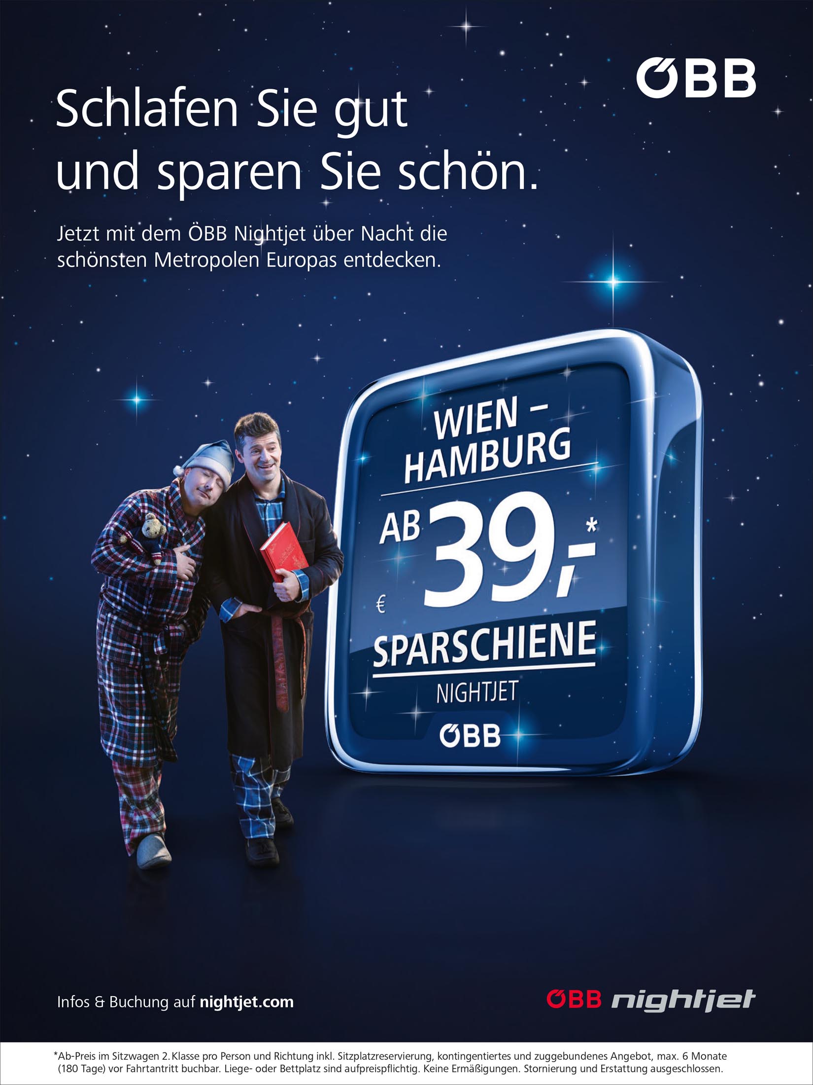
Because of sustainability and climate protection, a revaluation of overnight trains is getting on track. Nightjet is running from Amsterdam and Brussels to Vienna again, while Snälltåget directly connects Sweden to Berlin. New initiatives are also emerging, such as European Sleeper, which will connect Brussels and Amsterdam with Berlin and Prague. The Ostende Vienne Orient Experience is planning to provide night trains from Belgium to Austria and Italy. The French Midnight Trains will focus on the luxury segment.
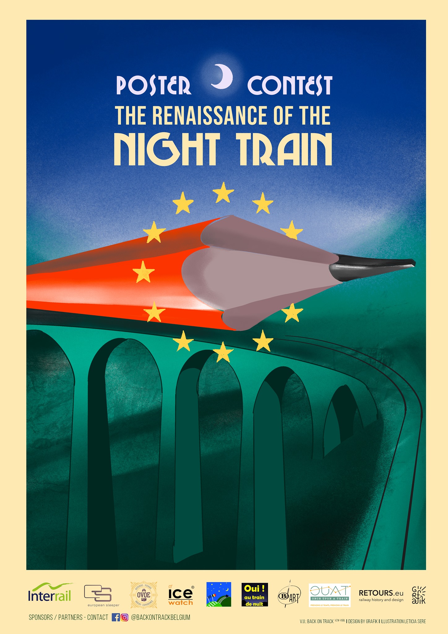
The few recent posters from CityNightLine and Nightjet are rather prosaic. To change this a design contest is being held during the European Year of Rail. The contest is organized by Back on Track, a Eruopean collective promoting cross-border train traffic. Motto of the poster competition is 'The Renaissance of the Night Train'. Submitted designs cannot be photographs and must demonstrate the benefits of overnight trains. RETOURS will supply one of the judges. Prizes include an InterRail pass and night train tickets.